Ugly colours and fabrics in quilting
I wonder how many want to read tips about using ugly colours and fabrics in quilting. But oh well, perhaps you are here because you are curious. If you are here.
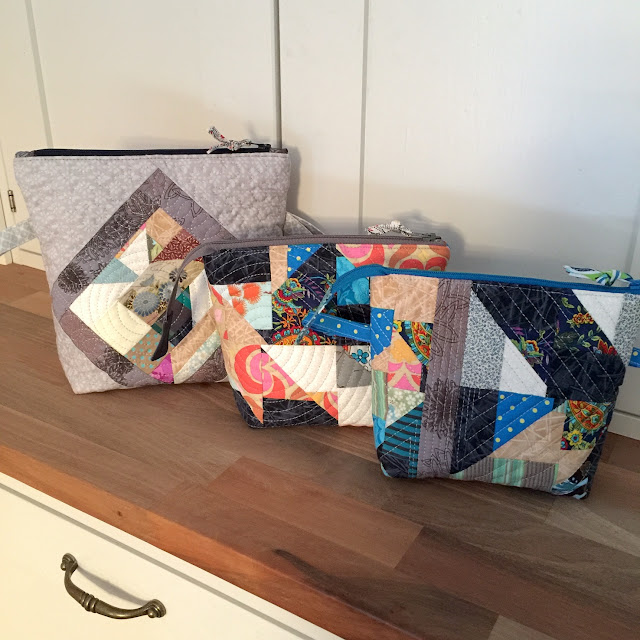
An ugly colour is any colour that you don’t like. The reason may be anything, really. I don’t like mustard yellow because it reminds me so much of the 1970s classrooms, rife with the odour of sweat. And there is a particular green that I find exceptionally ugly. Though my principle is to use fabrics that please me, I did challenge myself once in 2020 to sew something using mustard-yellow fabric. The result: Catlandia / Kissalandia quilted zipper pouch:

On the other hand, someone else somewhere will like the colours that you don’t. That’s why you should be careful not to declare (out loud) that someone else’s quilt colours or fabrics are ugly. People see colours differently and the quilt maker might very well like those colours because they don’t see them quite the way you do.
For example, there must be many quilters who quite like mustard yellow or even love it, even though it's one of my least favourite colours.
Already in 2012, I practiced quilt thinking and shared my take on using and combining beautiful fabrics. This was my example: one mid-level ugly block and another, very ugly one. Also, none of the fabrics “matched” in the regular sense of the word.
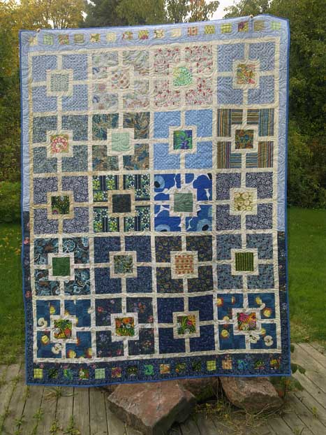
The circle in this picture shows that very ugly block: These blocks eventually became the Grass Is Greener / Ruoho on vihreämpää quilt, and none of its ugly fabrics or blocks cause pain on my eyes at least. See if you agree:
 When you come across a bargain fabric that you find pretty ugly, it may be in your interest to consider if it could be something to use. If not in a quilt, then as a bag lining, a border or binding. And who knows, that ugly fabric may surprise you yet, like the number 11 fabric in the following image surprised me:
 I bought a length of that bargain fabric some time around 2009-2010 to use for laptop bag linings. I had developed a pattern to use to make laptop bags and needed larger fabric pieces. I had to choose relatively ugly fabrics for the linings because otherwise, I would not have had the heart to “waste” such large pieces.
Even so, that particular fabric turned out to work so much better as a border in my Something Wild / Villit kuviot quilt (after which I didn’t have enough of it left to use in any kind of lining): An ugly fabric usually turns into an ok one if you cut it small enough. Another way to transform the appearance of an ugly fabric is to use it with an abundance of lovely (or lovelier) fabrics. I took advantage of both principles in my Prince Valiant / Prinssi Rohkea quilt from year 2023.
This image shows two squares of fabrics that I do not like at all: And here you can see the Prince Valiant quilt at work as a bedspread. The occasional ugly square here and there makes no difference in this loveliness:
 If your stash includes fabrics so ugly that you know you never will use, you can always offer them or at least some of them to another quilter. One’s trash is another’s treasure – this has been proven time and time again.
More than a decade ago, one of my quilting guild friends brought a length of brown fabric to our “Awful fabrics” themed guild meeting. She gave the whole length to me because I said I found it splendid. For her, that fabric had proven to be impossible to use.
There was enough of the fabric for the many block borders in my toddler-sized, retro-coloured Over the Lake / Yli järven quilt from year 2017. Taking a side-step here: when researching for my post, I happened across some images from the time that I was making the Over the Lake quilt. I can’t fathom how I’ve been able to make such fundamentally pleasant-looking quilt blocks out of a motley collection of odd-coloured and strange-patterned fabrics that don’t really match.
 In addition to mustard yellow, I have an aversion to one specific dark green. One shade of green is so fug-ugly that I would never buy fabric in that colour. Except that I did once, because such-coloured green fat quarter was part of a bundle of otherwise super attractive Carolyn Friedlander fabrics.
 The fabrics (all of them except one) were so attractive that contrary to my habits, I opened the bundle almost immediately and even started using those fabrics on my then-current, so-called x plus project. And I also used that fug-ugly green fabric:
 In case you don’t recognise which of these fabrics is that ugly green, it is that darkest green with small, darker patterns that run vertically in this picture. There are two such pieces showing in the photo.
An ugly fabric or a fabric that somehow feels challenging can add to the interest of your quilt. A strange, peculiar, outsider fabric may be give your quilt just enough of an edge that lifts your nice quilt on the fabulous level.
A note of caution that may help you avoid using ugly fabrics. Use your stash! Fabrics love to be used. Sometimes a nice fabric purchase will silently (and mysteriously) take revenge on you not using it and turn into an ugly one while languishing in your stash.
Then, one day, you will pick up that piece and the first thing that comes to your mind is “what was I thinking”! Not a nice feeling! That is how I felt when I recently came across these three fabrics: I know I once chose to buy them, and not for a project that might be going to another person, but for my projects in general. And yet, I cringe at the thought of using any of these as a visible part of a project. (Though having just written this post, I may have an idea or two for handling this situation.)
Final words about ugly fabrics and patterns. Many quilters believe that choosing the colours and matching them in a perfect way is the route to a gorgeous quilt. It is not enough, however. Colour gets the credit when it is in fact value that does the work.
So, if your quilt finish looks… ‘meh’ or not as good as you had envisioned, don’t start by blaming your colours or fabrics and calling them ugly. It is a better idea to first check that the quilt or its blocks have proper value contrast.
I’ll be discussing other colour topics soon, sharing tips and stories from my own quilts. If you want to be sure to get all my colour tips – and possibly other fun updates as well – you can subscribe to my biweekly newsletter.
(When subscribing, remember to take the second step: you will get an email asking you to confirm. My emailing system can only send you the newsletters if you have clicked on the button in that email.)
An ugly colour is any colour that you don’t like. The reason may be anything, really. I don’t like mustard yellow because it reminds me so much of the 1970s classrooms, rife with the odour of sweat. And there is a particular green that I find exceptionally ugly.

What to watch out for when using ugly colours and fabrics?
Though you may feel that you need to use the ugly-coloured or otherwise unpleasant-looking fabrics in your stash – or feel that you have to challenge yourself like that – don’t overdo it. It’s so much more fun to handle attractive, likeable fabrics. Why force yourself spend time with colours that you don’t much like?On the other hand, someone else somewhere will like the colours that you don’t. That’s why you should be careful not to declare (out loud) that someone else’s quilt colours or fabrics are ugly. People see colours differently and the quilt maker might very well like those colours because they don’t see them quite the way you do.
For example, there must be many quilters who quite like mustard yellow or even love it, even though it's one of my least favourite colours.
How to be successful when using ugly colours and fabrics
It feels good to use pretty fabrics in quilt projects, and those projects often turn out attractive. However, creating a splendid quilted item does not require that all its fabrics are lovely! Even my Catland zipper pouch with the mustard-yellow colour (that I dislike) turned out nice.Already in 2012, I practiced quilt thinking and shared my take on using and combining beautiful fabrics. This was my example: one mid-level ugly block and another, very ugly one. Also, none of the fabrics “matched” in the regular sense of the word.
The circle in this picture shows that very ugly block:
Even so, that particular fabric turned out to work so much better as a border in my Something Wild / Villit kuviot quilt (after which I didn’t have enough of it left to use in any kind of lining):
This image shows two squares of fabrics that I do not like at all:
More than a decade ago, one of my quilting guild friends brought a length of brown fabric to our “Awful fabrics” themed guild meeting. She gave the whole length to me because I said I found it splendid. For her, that fabric had proven to be impossible to use.
There was enough of the fabric for the many block borders in my toddler-sized, retro-coloured Over the Lake / Yli järven quilt from year 2017.
An ugly fabric or a fabric that somehow feels challenging can add to the interest of your quilt. A strange, peculiar, outsider fabric may be give your quilt just enough of an edge that lifts your nice quilt on the fabulous level.
A note of caution that may help you avoid using ugly fabrics. Use your stash! Fabrics love to be used. Sometimes a nice fabric purchase will silently (and mysteriously) take revenge on you not using it and turn into an ugly one while languishing in your stash.
Then, one day, you will pick up that piece and the first thing that comes to your mind is “what was I thinking”! Not a nice feeling! That is how I felt when I recently came across these three fabrics:
Final words about ugly fabrics and patterns. Many quilters believe that choosing the colours and matching them in a perfect way is the route to a gorgeous quilt. It is not enough, however. Colour gets the credit when it is in fact value that does the work.
So, if your quilt finish looks… ‘meh’ or not as good as you had envisioned, don’t start by blaming your colours or fabrics and calling them ugly. It is a better idea to first check that the quilt or its blocks have proper value contrast.
Earlier posts in the splendid colour tips series
In case you have missed some of my colour tips, here is a comprehensive list:- Using white in quilts
- Using multicoloured, patterned fabrics
- Fashionable colours in quilts
- Colour palettes
- Using just one colour
- Beige colour in quilts
- Pink colour in quilts
- Blue colour in quilts
- Using black in quilts
- Red colour in quilts
- Purple colour in quilts
- Grey colour in quilts
- Yellow colour in quilts
- Brown colour in quilts
- Turquoise colour in quilts
- Orange colour in quilts
I’ll be discussing other colour topics soon, sharing tips and stories from my own quilts. If you want to be sure to get all my colour tips – and possibly other fun updates as well – you can subscribe to my biweekly newsletter.
(When subscribing, remember to take the second step: you will get an email asking you to confirm. My emailing system can only send you the newsletters if you have clicked on the button in that email.)


Comments