Splendid colour tips for quilting: Red in quilts
This post is part of my Splendid colour tips series, where I share helpful information to help you choose fabrics and colours with more confidence. In this post, I share my thoughts and practical tips about the use of red in quilting and use my own quilts and quilted items as examples.
 In this post you’ll discover:
Because red represents passion, it is a great colour choice for a quilt meant for the love of your life.
It is said that the red centre square in the traditional log cabin block is a symbol of the hearth and warmth of home.
I’ve not sewn many log cabin quilts and do not remember if I’ve chosen a red centre square for any of them. However, I’ve used red at the centre of other blocks. For example, the Bento Box blocks in the Empress Ramandu quilt have red at the centre. And the blocks in the Fair Play / Reilua peliä quilt features red pluses at the centre:
Red and green are complementary colours: clear red and clear green have no common colour base. If you choose to combine an intense red with an equally intense green in your quilt, the combination will clash. Of course this may be the effect you seek!
Certain reds and greens together, and especially combined with a bit of white can easily bring Christmas to mind. Be aware of this if you aren’t making a holiday themed quilt or quilted item.
Here’s my intentionally holiday-themed mug rug as an example: Because red and yellow are primary colours and high-intensity colours too, they may look garish together. The fabric of one of my early zipper bags – a test piece of sorts – features red, yellow and blue, AND bright green. This was a small piece and proved to me that I would not choose this look for anything bigger, let alone a quilt!
 I've also mentioned in my purple colour in quilts post that choosing to place warm reds next to cool purples and certain blues may not please everyone’s eye. Some quilters dislike the combination so much that for them, this is a solid rule and not only a “watch out for” item.
A practical tip: Red fabrics are prone to bleeding. A careful quilter will prewash their red fabrics before using them in projects. (A less careful quilter may decide to prewash their red fabrics the next time.)
My Frost Flower / Kuurankukka quilt is an all-year-round Christmas quilt and it is almost all red and white: A quilt surface with bright red and white tends to look fresh, bringing to mind peppermint candy:
 This Ring Around the Rosie / Piiri pieni pyörii quilt is also red and white – or thereabouts, since I’ve again interpreted the colours freely:
 A combination of red and white can also be associated with the Danish flag, which holds the Guinness world record of being the oldest continuously used national flag (since 1625). The Danish flag is called Dannebrog, and so is this zipper bag:
 Another flag-inspired colour combination is red, white and blue, and it doesn’t always mean the American flag. I made this zipper bag for my Norwegian friend. It combines the red, blue and white in their national flag:
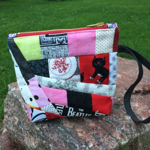
 Red and blue are primary colours and can together create a no-nonsense feel. The Joy of Life / Elämänilo bag is an example of that:
 It is possible to combine all three primary colours in a patchwork without the result hurting the eyes:
 This zipper bag looks fresh rather than garish because red fabrics are only present as small pieces, with blue and yellow as dominating colours. The bright white fabrics also help to diminish the colour contrast between the three primary colours.
For a combination of clear red and blue fabrics in your patchwork, try a softer neutral such as pale beige. The look can be surprisingly elegant, as you can see in the Takataan roos quilted bag, for example: When you want your quilt to have a dramatic look, try combining deep reds with black. In my Progress/Edistys quilt, you can see the effect of a larger expanse of red “puzzle piece” blocks surrounded by a black border:
 A narrow red border around your quilt center, before a wider border of a contrasting colour can look surprisingly good. For example, see how effective such a narrow strip is – this time next to black (in my Empress Ramandu quilt):
 One more example of red-black drama, this time in a piece of Marimekko fabric which I turned into a zipper bag called Vekkula:
 Although the colour contrast between red and green can be strong, it is possible to use them together in a quilt more harmoniously. My early wall textile Sacrifices/Uhrauksia from 2002 is an example of a two-colour design in red and green.
All blocks are half-square triangles with a red and a green side: My only reason for choosing red and green was that I happened to have the best variety of different fabrics in those two colours. I did not even stop to consider them as opposite colours.
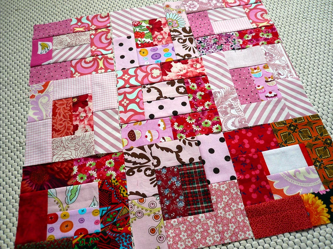
I chose to interpret the colours on a very wide scale. All kinds of reds, from orange to maroons and everything in between. And because I was following the instructions of the book “Spectacular Scraps: A Simple Approach to Stunning Quilts,” I made sure I had light, mid-value and dark fabrics in both colours. The blocks created a clear pattern on the patchwork surface because I had been intentional with value contrast, and I was pleased with the results.
Here is one more creation that combines red with green: My own favourite combo for quilted items is probably red and pink – or red, orange, pink and other red-hued fabrics!
 Although pink is a colour on its own, you can decide to treat it as red colour. This Roosan nimi zipper bag is a fun example of combining reds with pinks:
 I could share a dozen examples of red fabrics combined with other reds. I’ve sewn so many red zipper bags that it’s been harder and harder to come up with suitable names for them. I confess that I’ve named two creations with the same name – twice! I have made a Punatulkku zipper bag and Punatulkut laptop bag, and two Rose-red/Ruusunpuna zipper bags.
Rose-red/Ruusunpuna from 2016: Rose-red/Ruusunpuna from 2011:
 Next to the red part in your quilt, you can place oranges that lead into an area of yellow. On the other side of the reds, add purple that leads to blue. See an example of this in the Sixten quilt:
 Psst! You can make your own version of this hexagon-featuring quilt, following my Sixten quilt pattern which is available in English as a PDF download from the Tilkkunen webshop.
 It has an overall reddish feel, but when you look closer, you will see that it includes so many other colours, too.
Pay attention to value contrast and your colour choices will be easier.
It has an overall reddish feel, but when you look closer, you will see that it includes so many other colours, too.
Pay attention to value contrast and your colour choices will be easier.
I hope the examples from my own quilts have inspired you to see new possibilities for using red in your future projects.

- how different reds can behave next to green, neutrals, and other reds
- common colour-contrast problems when sewing with red (and how to avoid them)
- reliable ways to combine red fabrics successfully in your own quilts
Red colour represents passion, energy, excitement and danger. It is a vibrant colour and so effective, that only a small piece is often enough to draw the eye in a quilt.
Because red represents passion, it is a great colour choice for a quilt meant for the love of your life.
It is said that the red centre square in the traditional log cabin block is a symbol of the hearth and warmth of home.
I’ve not sewn many log cabin quilts and do not remember if I’ve chosen a red centre square for any of them. However, I’ve used red at the centre of other blocks. For example, the Bento Box blocks in the Empress Ramandu quilt have red at the centre. And the blocks in the Fair Play / Reilua peliä quilt features red pluses at the centre:
What to watch out for when using red in quilts
In the Purple colour in quilts post I mentioned that purple may look surprisingly close to brown, and red shares that characteristic. Even though one red fabric may look very different in colour next to a brown fabric piece, especially up close, they may not have enough value contrast between them in a quilt.Red and green are complementary colours: clear red and clear green have no common colour base. If you choose to combine an intense red with an equally intense green in your quilt, the combination will clash. Of course this may be the effect you seek!
Certain reds and greens together, and especially combined with a bit of white can easily bring Christmas to mind. Be aware of this if you aren’t making a holiday themed quilt or quilted item.
Here’s my intentionally holiday-themed mug rug as an example:
A practical tip: Red fabrics are prone to bleeding. A careful quilter will prewash their red fabrics before using them in projects. (A less careful quilter may decide to prewash their red fabrics the next time.)
How to use red successfully in quilts
When you, the careful quilter have prewashed the deep red fabrics, making sure that they won’t bleed, you can combine them with lighter fabrics – even with white. Red and white is a very traditional combination and can be associated with Christmas, with or without green colour.My Frost Flower / Kuurankukka quilt is an all-year-round Christmas quilt and it is almost all red and white:
For a combination of clear red and blue fabrics in your patchwork, try a softer neutral such as pale beige. The look can be surprisingly elegant, as you can see in the Takataan roos quilted bag, for example:
All blocks are half-square triangles with a red and a green side:
I chose to interpret the colours on a very wide scale. All kinds of reds, from orange to maroons and everything in between. And because I was following the instructions of the book “Spectacular Scraps: A Simple Approach to Stunning Quilts,” I made sure I had light, mid-value and dark fabrics in both colours.
Here is one more creation that combines red with green:
Rose-red/Ruusunpuna from 2016:

Quick tips for using red with more confidence
If red feels difficult to use in a quilt:- Try starting with red, blue and a light neutral for your quilt or quilted item
- Use red in your quilt only as a small highlight
- Choose a muted red if you feel uncomfortable with bright reds
- Create test blocks to see which colours you like together with red
- Check that your test blocks show enough value contrast.
Final thoughts
If you like colours in general, you can combine reds in a quilt with any other colours as long as you take care of value contrast. My Hello/Haloo quilt from 2025 is an example of the power of value contrast – lights vs darks – in a quilt.I hope the examples from my own quilts have inspired you to see new possibilities for using red in your future projects.
Earlier posts in the splendid colour tips series
I’ll be discussing other colours soon, sharing tips and stories from my own quilts. If you want to be sure to get all my colour tips – and possibly other fun updates as well – you can subscribe to my biweekly newsletter.


Comments