Splendid colour tips for quilting: Using black in quilts
This post is one of my Splendid colour tips series, where I share information to help you choose fabrics and colours for your quilts with more confidence.
In this post, I’ll share:
 Black is categorised as an achromatic colour together with grey and white. They are void of colour, and we quilters usually call them “neutrals”.
Psychologically, black represents power, luxury, sophistication and elegance. Luxury brands use black to convey an image of professionalism, strength, and precision.
An interesting possibility to consider: since black projects an image of professionalism, a stylishly black quilt might be a smart choice for a professional quilter’s advertisement.
The contrast between a deep black and a clear white is sharp and may be effective, but it can also be too hard. Here’s an example from more than 15 years ago, a small zipper pouch: You can see that it features a large scrap with a large black-and-white pattern, another scrap of white fabric with tiny black polka dots, and next to them, a dark patterned fabric. There is a lot of very sharp contrast in a small surface, and the zipper bag would probably look more balanced if I had cut the largest scrap a bit smaller, for example.
Here’s another example of a quilted item that features a sharp black-and-white patterned fabric. Mega contrast there as well: The brown stripes do tone down the harsh effect, and the scale of the print is more in line with the size of the item.
A predominantly black surface, even with black-and-white patterned fabrics can look solemn and even a little dreary. This is one of my rare made-to-order items, and I believe that the recipient appreciated the resulting bag. In my eyes, the contrast is good, but the surface looks too strictly black-and-white. But I like colours, so I would think this way.
 Value contrast between mid-value and light-coloured scraps may be diminished, especially with black next to that area in your quilt.

I was struggling with how to save the surface when my friend Soile suggested those sashings, and they really brightened up the quilt surface. Here’s the finished Alert Mind / Valpas Mieli quilt: If you have sewn blocks but they don’t look quite right together as a surface, plain black or nearly black sashing strips could save the day, just as the black-and-white stripes did for my bento box quilt. Perhaps some of your colours are too distracting when next to each other.
I was in that situation with my quarter log cabin blocks: Then I had an idea to cut a very narrow, black sashing, and it had just the calming effect the surface needed:
 I really liked the look: almost like someone had drawn a line around each block.
Instead of an all-black or all-white sashing, alternating white and black borders around your blocks or block units can be suprisingly effective. When making my first version of the Amity quilt, the blocks themselves looked fun, but they did not look great next to each other. So I separated the blocks with alternating borders: Eleven years later, I made another version in neutral colours while creating the Amity pattern.
 Commercial break –
As you can see, Amity is a versatile pattern! How would it look in your favourite colours?! You can find it in English language in Tilkkunen webshop: https://tilkkunen.com/en/products/amity-quilt-pattern-tilkkupeiton-ohje
And here you will find several colour choices that my pattern testers made: https://tilkunviilaaja.blogspot.com/2023/10/Amity-kaava-Amity-pattern.html You could apply the psychological aspects of black and grey in your quilts: both are considered elegant colours (as we learned in the grey in quilts post earlier), so combining them could achieve next-level elegance. Black and grey (and maybe a bit of white, too) might be just the right look for a quilted gift for a sophisticated person.
Instead of a dash of white, I’ve added yellow to one side of my Kimono zipper bag. I think it still looks rather elegant. And the Gifted/Etevä zipper bag combines black, grey, white – and a small, pink highlight. Elegant enough, don’t you agree?
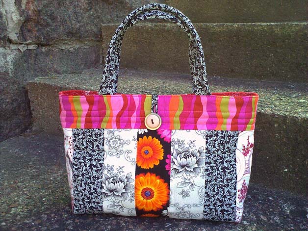
 Or, use black in your quilt or quilted item as an accent! Just as specks of colour can bring interest to a black-and-white surface, a small scrap of deep black will add interest to a single-coloured surface. My Friends’ Day / Ystävänpäivä zipper bag is an example of that:
 Dashes and splashes of colour can create interest for an otherwise monochrome surface. And a bit of black can bring just the right accent on your colourful, scrappy surface.
 The fabric at the centre of this little bag is another proof of black making bright colours shine even more:
 And a third example of colours popping from a black background is the Spruces’ Whisper / Kuusten kuiske quilt from 2014:
 Black areas can also serve as background for your quilting stitches. See how effective my bright yellow pebble stitches look on a black surface:

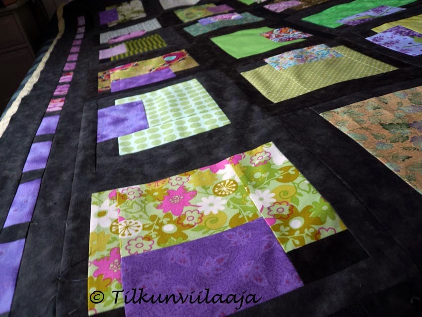
You can see the effect already in a group of blocks laid out on my design floor:
Whether you use black boldly, modestly or not at all is up to you. Trust your own eye because you should be your own target audience.
Black can be just the right background for your bright colours – and sometimes you will notice that a little of it goes a long way.
I’ll be discussing other colours soon, sharing tips and stories from my own quilts. If you want to be sure to get all my colour tips – and possibly other fun updates as well – you can subscribe to my biweekly newsletter.
In this post, I’ll share:
- My thoughts and helpful tips about using black in quilts
- What to watch out for, and ways to use black to effect in quilting
- Practical examples from my own quilts and quilted items

Psychologically, black represents power, luxury, sophistication and elegance. Luxury brands use black to convey an image of professionalism, strength, and precision.
An interesting possibility to consider: since black projects an image of professionalism, a stylishly black quilt might be a smart choice for a professional quilter’s advertisement.
What to watch out for when using black
Contrast does the work in quilts even though colour gets the credit. One might think therefore that the more contrast there is, the better for the overall look. It doesn’t work that way though!Black can create a contrast that is too harsh
People tend to think that black will always be a great choice when one wants contrast for a quilt surface. Sometimes, though, a dark grey or brown may work better.The contrast between a deep black and a clear white is sharp and may be effective, but it can also be too hard. Here’s an example from more than 15 years ago, a small zipper pouch:
Here’s another example of a quilted item that features a sharp black-and-white patterned fabric. Mega contrast there as well:
A predominantly black surface, even with black-and-white patterned fabrics can look solemn and even a little dreary. This is one of my rare made-to-order items, and I believe that the recipient appreciated the resulting bag.
Light colours will look even lighter next to black
When your quilt blocks have pieces in black and in very light colours, even a mid-value piece may blend into the lights. You may not want this to happen – for example, if your very light area is supposed to have a darker center in the block design – so watch out for this effect. You can see the interesting blending effect in my Stardust/Tähtipölyä quilt from year 2013:Ways to use black successfully in a quilt
To decrease the sharp-looking contrast between black and white (or a much lighter colour), use smaller areas of black.
Black and black-and-white borders or sashings
Though a vast area of high black and white contrast may be too much, sashings in black-and-white stripes could be just the right thing for your quilt surface. For me they were when my bento box blocks in fun batiks did not look great together.I was struggling with how to save the surface when my friend Soile suggested those sashings, and they really brightened up the quilt surface. Here’s the finished Alert Mind / Valpas Mieli quilt:
I was in that situation with my quarter log cabin blocks:

Instead of an all-black or all-white sashing, alternating white and black borders around your blocks or block units can be suprisingly effective. When making my first version of the Amity quilt, the blocks themselves looked fun, but they did not look great next to each other. So I separated the blocks with alternating borders:
As you can see, Amity is a versatile pattern! How would it look in your favourite colours?! You can find it in English language in Tilkkunen webshop: https://tilkkunen.com/en/products/amity-quilt-pattern-tilkkupeiton-ohje
And here you will find several colour choices that my pattern testers made: https://tilkunviilaaja.blogspot.com/2023/10/Amity-kaava-Amity-pattern.html
Monochromatic with a twist
A way to avoid creating a dreary-looking, all black-and-white surface is to introduce small specks of colour – they will instantly make your surface more interesting. The Madison zipper bag is an example of that approach:Instead of a dash of white, I’ve added yellow to one side of my Kimono zipper bag. I think it still looks rather elegant.
Black background for brights
A black background will make your bright colours pop, and my Otava quilt is a good example of the effect. I chose to use black as the background of my bear claw blocks, and they turned out really fun. The finished quilt looks traditional and modern at the same time:
Using black in quilts in a scrappy way
I intentionally mix black fabrics of different hues and even of slightly different values in a quilt because this approach matches the essence of quilting, where one uses pieces of fabric. In a finished quilt, the slightly different black fabrics can create a feeling of movement, which makes the surface look more interesting.You can see the effect already in a group of blocks laid out on my design floor:
Final thoughts
Using black in quilts can introduce drama, elegance, interest, or contrast on the surface.Whether you use black boldly, modestly or not at all is up to you. Trust your own eye because you should be your own target audience.
Black can be just the right background for your bright colours – and sometimes you will notice that a little of it goes a long way.
Earlier posts in the splendid colour tips series
I’ll be discussing other colours soon, sharing tips and stories from my own quilts. If you want to be sure to get all my colour tips – and possibly other fun updates as well – you can subscribe to my biweekly newsletter.


Comments
Greetings from Germany, Martina