Splendid colour tips for quilting: Purple in quilts
This post is part of my Splendid colour tips series, where I share helpful information to help you choose fabrics and colours with more confidence. In this post, I share my thoughts and practical tips about the use of purple in quilting and use my own quilts and quilted items as examples.
 In this post you’ll discover:

- how different purples can behave next to blue, red, yellow, green and turquoise
- common colour-contrast problems when sewing with purple (and how to avoid them)
- reliable ways to combine purple fabrics successfully in your own quilts
Purple is a colour for queens, kings, and royalty. It represents success and wisdom. It has traditionally been associated with wealth because the colour was difficult and expensive to produce. Only the richest could afford purple garments.
In quilts, purple isn’t a symbol – it is a colour that has its own characteristics. Because cool-toned, bluish-purple is very close to blue, those two colours are not likely to have enough colour contrast between them. If you use both colours in your quilt, check that they have value contrast if you don’t want them to blend into each other. Value contrast matters more in quilting than colour contrast.
Here is a surface where purple and blue have blended – though this time, it was an intentional effect. The same goes for red-hued purples and red: they can blend into each other on your quilt surface if you do not watch for value contrast.
There may be controversy about combining cool purples with warm reds. When working on my “Gran’s House” / “Mummola” quilt, I first sewed its center part in blues and purples. I was surprised to read the comments from some of the blog followers: they thought that a cool purple and a warm red placed next to each other created an unpleasant clash. This is a matter of taste, and I do not care if a colour is warm or cool because value contrast matters most in quilting. Also, the best way to match two fabrics is to sew them together, as Angela Walters has said.
For this quilt, though, I added a sashing between the cool-coloured center and the round of warm, red blocks because it helped make the piece slightly bigger. If you feel that some of your blocks do not match or that they may blend into each other, you too can use a sashing to create a breathing space or contrast between those blocks. In this photo, the finished “Gran’s House” quilt poses on the concrete stairs that were on their last legs at the time. Note the rusty railing, too. Funny how good they looked in photos, though.
 Yellow and purple are opposite colours (as we learned in the Yellow in quilts post), and the colour contrast between them is significant. Purple aubergines on this yellow background is fine for a quilt back, but a similarly coloured quilt might feel like too much.

 One of my quilt projects in 2021 began in a promising way, all blocks in greens and purples:
 These scrappy blocks still belong to my all-time favourites, and I wish they looked as great on the finished “Michaelmas Daisies” quilt, which appears more pastel-coloured.
Here’s a tip that you can apply to any colour: When you don’t have enough of a certain fabric for a block but want to use every bit of your scraps, you can match different fabrics as long as they are of the same colour and value. Here is a deep purple example: You won’t notice the differences in one block in the finished quilt.
When sewing these scrappy blocks, I also noticed that a fabric did not have to be lilac through and through to be representative of that colour. See the example in this lilac-and-green quilt block: Purple is a common colour in batik strip packages (at least in the ones I’ve purchased). This purple strip featured enough dark green to make one question what its prominent colour was.
 One more example of the excellent cooperation between purple and green:
 Because purple has blue as its colour base, purple and blue is a calm, elegant combination – as long as you take care of their value contrast! I’ll use the “Gran’s House” quilt again as an example:
 Even though a combination of purple and warm orange/red does not please everyone’s colour sense, I like it. The “Colour Queen” / “Värikuningatar” quilt is a good example of this. The quilt is in its construction phase in this photo:
 Here is another pleasing combo of purple and red.
 The “Ace of Diamonds” / “Ruutuässä” quilt was a roaring success for me, mostly thanks to the lovely purples that I picked for it. It was also an extremely educational project: for the first time during my quilting career I really understood the importance of value contrast.
(I have been a slow learner about contrast: by that time quilting had already been my dear hobby for more than 20 years.)
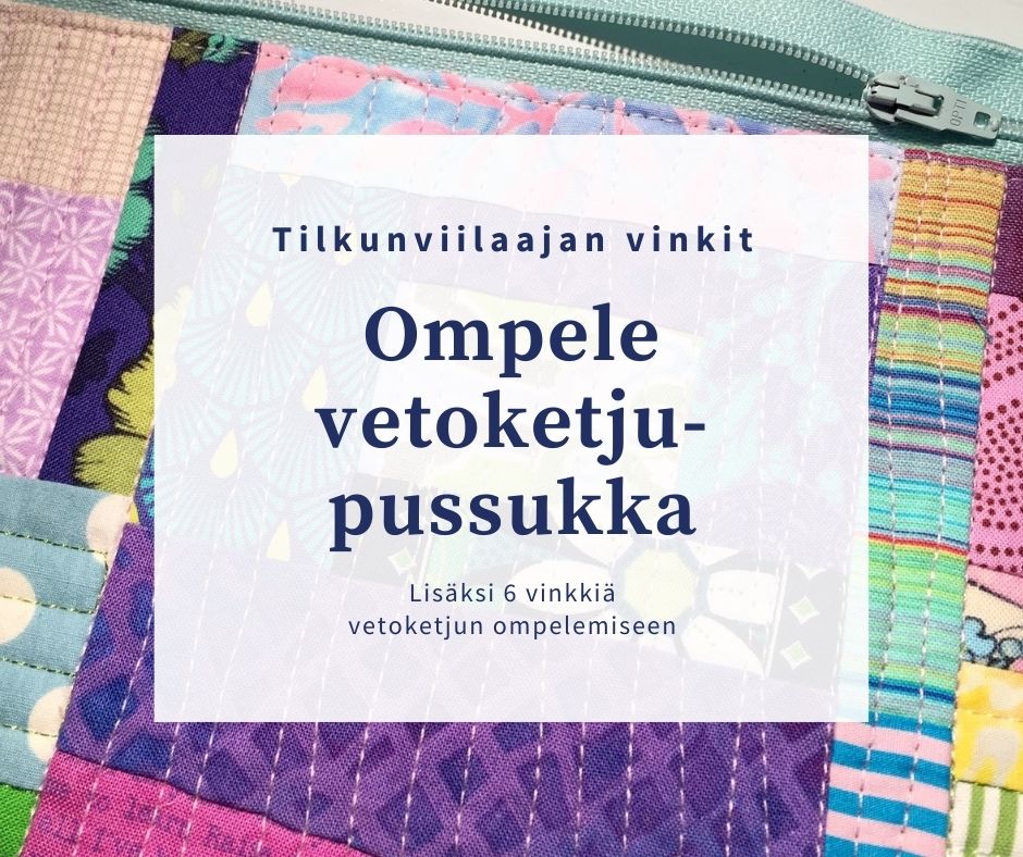
In addition to appreciating the lovely purples, see how well orange plays with them: Over the years, the Finn Quilt – the abbreviated name of the Finnish Quilting Association – has made a series of limited edition of the logo fabric in different colours. One year, lilac shade of purple was the theme colour – and I used it for a purple themed zipper bag:
 I’ve shown the following image in the post on Turquoise in quilts, but it is worth showing again. See how the turquoise and purple emphasise each other on the surface of this quilted bag:
 Here is an example of pale lilac beautifully combined with turquoise. And perhaps the most gorgeous one: the deep purple.
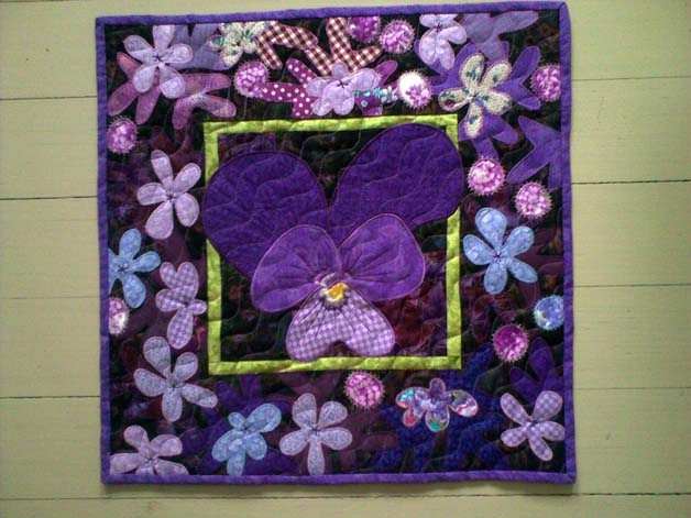
 Purple will of course look good with other purples – as long as you take care of the value contrast. This is my creation for a challenge that called for a mini quilt all in purple – only a maximum of 10 % of other colour(s) was allowed:
 Another example of purple and lilac and violet and maroon together is the “Hämärän jälkeen” / “After Twilight” quilt from year 2011. It is one of my earliest quilt makes – and I even quilted it myself.

In quilts, purple isn’t a symbol – it is a colour that has its own characteristics.
What to watch out for when using purple in quilts
Certain purples can look brown in the finished quilt, so watch out for that if it’s not your intention. Here’s an example from a time I chose a purple to represent brown in my work:Here is a surface where purple and blue have blended – though this time, it was an intentional effect.
There may be controversy about combining cool purples with warm reds. When working on my “Gran’s House” / “Mummola” quilt, I first sewed its center part in blues and purples. I was surprised to read the comments from some of the blog followers: they thought that a cool purple and a warm red placed next to each other created an unpleasant clash.
For this quilt, though, I added a sashing between the cool-coloured center and the round of warm, red blocks because it helped make the piece slightly bigger. If you feel that some of your blocks do not match or that they may blend into each other, you too can use a sashing to create a breathing space or contrast between those blocks.
How to use purple successfully in quilts
Purple and green is one of my own favourite combinations. When the colours are bright enough, a background of black or very dark grey can set them off beautifully. You can see the effect in these block beginnings that I set up for the “Spruce Whispers” / “Kuusten kuiske” quilt:Here’s a tip that you can apply to any colour: When you don’t have enough of a certain fabric for a block but want to use every bit of your scraps, you can match different fabrics as long as they are of the same colour and value. Here is a deep purple example:
When sewing these scrappy blocks, I also noticed that a fabric did not have to be lilac through and through to be representative of that colour. See the example in this lilac-and-green quilt block:
(I have been a slow learner about contrast: by that time quilting had already been my dear hobby for more than 20 years.)
In addition to appreciating the lovely purples, see how well orange plays with them:
Quick tips for using purple with more confidence
If purple feels difficult to use:- Try starting with purple and green
- Choose one light and one dark purple
- Create test blocks to see if you like the colours
- Check value contrast in your test blocks.


Comments