Splendid colour tips for quilting: Pink colour in quilts
This post is one of my Splendid colour tips series, where I share information to help you choose fabrics and colours for your quilts with more confidence.
In this post, I’ll share
 Pink represents femininity, sweetness, innocence, fertility, and romance. Pink is often used when marketing services and products for women and girls.
Pink is an interesting colour and word for me as a Finn. When I was younger, the word “pinkki” was not part of our vocabulary. Even now, we call pale pink “light red” and Pink Panther isn’t “Pinkki pantteri,” but “Light Red Panther”. Also, not having used the word makes it harder for me to recognise (or name) it with confidence.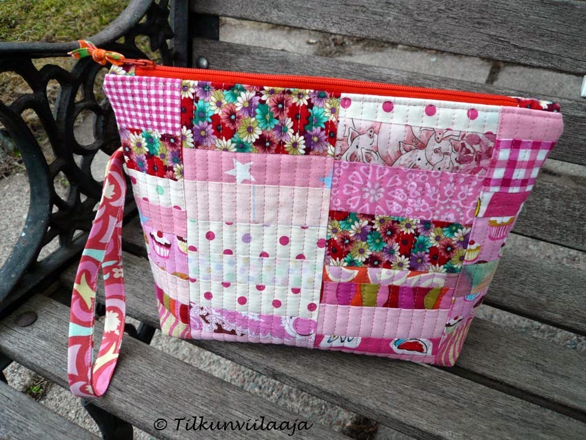 Even this Higgledy Piggledy / Vinksin vonksin zipper bag probably would not attract a pink-hater (or a person who doesn’t like flower patterns). Its surface looks relatively neutral, but the pink scraps move it into the “not for everyone” category:
 Because pink is a cute colour, you may want to watch out that your pink creation doesn’t become a cute overload – unless that is your target.
 So, watch out for that combination which may fool the eye: make sure that your pink and your yellow have enough value contrast.
If I had only used the above blocks in the surface of Fabric Anemone / Kangasvuokko quilt, the centres would perhaps not stand out very well. However, if only a couple of blocks have less value contrast, it does not matter in the bigger picture. The flowers stand out well enough: Hot pink and bright spring green are practically the opposite of each other in the colour wheel. The colour contrast between them is so wild that the combination may make your teeth ache. As an example, my candy-coloured quilted bag from 16 years ago:

Because I don’t always identify pink as a colour of its own (for my long lack of a word for it), I often treat it as a shade of red – and in my eyes, a pink-red combination is great! I remember being a little surprised to get a comment to this zipper bag, saying that the red colour added interest to the pink areas: When I was sewing this, I had chosen a variety of red scraps – and pinks too, because I did not consider it a different colour, only a different hue.
If you categorise pink into the generic “reds” box, you may get interesting results – and even more so if you include orange, too. I did that when sewing X and plus blocks for a quilt. I set myself a rule to use “reds” for the plus shapes, and here you can see something of the variety of colours that ended up being considered “reds”: Pale pink could work as a neutral, too. I haven’t used it as such, but recognise the possibility when looking at the log cabin block on the surface of my Random / Satunnainen zipper bag:
 Your quilt surface will look playful if you combine several pinks with pale purple or other pastel colours. The Lotus Flower potholder features a charming pale green, playfully combined with pinks:
 Not everyone will like the combination of pink and orange, but it can bring excitement to your quilt surface.
 Again, check that your pinks and oranges have enough value contrast – or you will end up with an area where those to colours blend in. I didn't check the value contrast and used the pieces shown in the previous photo as centers for rectangular blocks:
 That project never amounted to anything because I hadn’t thought enough about value contrast.
Pinks and greens play together on the Soft and Piggy Pink / Pehmeää ja possunpunaa baby quilt. I sewed this quilt for my guild’s quilt exhibition “Being Childlike” in 2012, and it waited for a proper baby owner until 2024. I’m happy that it finally found a home! This quilted zipper pouch with its greens and pinks is not too serious-looking, either:
 When researching for this post, I discovered that I like to combine pinks with other pinks, reds, and greens. This was my initial fabric pull for a project in 2014 (and interestingly, I’ve used “red fabrics” as part of the image file name):
 After complementing that initial pull with a few greens, they became the Sleeping Beauty’s Daydream / Ruususen päiväuni quilt:
 Any hue and shade of pink will look stylish combined with black, grey, and dark or mid-value blue. In this Dark Side of the Moon / Kuun pimeä puoli quilted zipper bag, pink livened up the otherwise dark surface:
 Garden Party / Mehukestit puutarhassa zipper bag features a fabric with pink roses on a pale grey background. It’s still one of the most elegant fabrics that I have in my stash:

After all, value contrast matters more in quilts than colour contrast or colour matching.
It's worth remembering all the same that nobody forces you to use colours that you aren’t comfortable with. You should consider yourself as your target audience, and if you aren’t making a commission quilt/project, your own preferences are the most important.
Do you like pink or hate it? When did you use pink with great success? Let me know in the comments!
I’ll be discussing other colours soon, sharing tips and stories from my own quilts. If you want to be sure to get all my colour tips – and possibly other fun updates as well – you can subscribe to my biweekly newsletter.
In this post, I’ll share
- My thoughts and helpful tips about using pink colour in quilts
- What to watch out for, and ways to use pink to effect in quilting
- Practical examples from my own quilts and quilted items

Pink is an interesting colour and word for me as a Finn. When I was younger, the word “pinkki” was not part of our vocabulary. Even now, we call pale pink “light red” and Pink Panther isn’t “Pinkki pantteri,” but “Light Red Panther”. Also, not having used the word makes it harder for me to recognise (or name) it with confidence.
What to watch out for when using pink
Some people cannot abide pink; I once heard a male colleague say that he would never, ever wear a pink shirt. Therefore, it is not the best idea to use pink colour in quilted items that you target for a "general audience". Pink-hating people such as my colleague would probably be mortified if they received this Roosa’s Name / Ruusun nimi zipper pouch as a present!Don't rely on colour contrast alone
Pink and yellow are not exactly complementary colours, but the colour contrast between them is very clear. However, if your pink and yellow are of the same value, they can easily blend into each other in a quilt viewed from a distance.If I had only used the above blocks in the surface of Fabric Anemone / Kangasvuokko quilt, the centres would perhaps not stand out very well. However, if only a couple of blocks have less value contrast, it does not matter in the bigger picture. The flowers stand out well enough:
How to use pink successfully in quilting
Not every woman or girl likes pink, but most females will find the colour pleasant.Because I don’t always identify pink as a colour of its own (for my long lack of a word for it), I often treat it as a shade of red – and in my eyes, a pink-red combination is great! I remember being a little surprised to get a comment to this zipper bag, saying that the red colour added interest to the pink areas:
If you categorise pink into the generic “reds” box, you may get interesting results – and even more so if you include orange, too. I did that when sewing X and plus blocks for a quilt. I set myself a rule to use “reds” for the plus shapes, and here you can see something of the variety of colours that ended up being considered “reds”:
Pinks and greens play together on the Soft and Piggy Pink / Pehmeää ja possunpunaa baby quilt. I sewed this quilt for my guild’s quilt exhibition “Being Childlike” in 2012, and it waited for a proper baby owner until 2024. I’m happy that it finally found a home!
Final reflections on pink colour in quilting
Whether you like pink as a colour in general, or for something that you wear or choose for decorating your home doesn’t have to matter when thinking about your quilt colours. If pink makes you slightly uncomfortable, you could teach yourself to think about it as one of the many red hues. This could let you explore surprising visual possibilities and effects.After all, value contrast matters more in quilts than colour contrast or colour matching.
It's worth remembering all the same that nobody forces you to use colours that you aren’t comfortable with. You should consider yourself as your target audience, and if you aren’t making a commission quilt/project, your own preferences are the most important.
Do you like pink or hate it? When did you use pink with great success? Let me know in the comments!
Earlier posts in the splendid colour tips series
I’ll be discussing other colours soon, sharing tips and stories from my own quilts. If you want to be sure to get all my colour tips – and possibly other fun updates as well – you can subscribe to my biweekly newsletter.


Comments