Splendid colour tips for quilters: Beige colour in quilts
This post is one of my Splendid colour tips series, where I share information to help you choose fabrics and colours for your quilts with more confidence. Today’s quilt colour is beige, and I’ll be sharing the following:
 Beige is a calm, balanced colour, and it can make us feel comfortable. Quilters usually categorise beige as a “neutral”.
Because beige is a neutral, it will go with pretty much any colour as long as you remember value contrast: make sure that your colours are clearly lighter or darker than the beige fabrics next to them. The value contrast may seem clear when you are looking at your fabrics up close, but it is good to make sure.
For example, I once wanted to make a less colourful surface and combined whites and lights with beige. The result was pale and contrastless: I sewed the surface into a cushion cover, and as such, the item served its purpose:
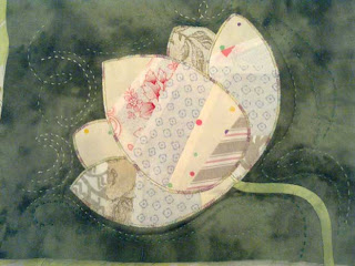
 Here's an interesting comparison to the contrastless piece. A similar, light-beige flower looked like this when I appliqued it on a moss green background:
 Beige comes in many hues, ranging from almost bluish-grey (the hue between grey and beige that is sometimes called “greige”) to a warm beige with a yellowish look. It's useful to consider your preferences. You will probably like certain hues of beige more than others, or feel more comfortable using some than others.
If your quilt or block calls for white pieces, they don’t all have to be of the same fabric, or even white - you can also use beige. When you apply this sort of freedom and accept that blocks will not have a uniform colour, you reduce the risk of running out of a certain fabric. You may be surprised by how dark your beige “whites” can be and still read correctly on a quilt surface. Or how cohesive a quilt can look even when all its beige background fabrics are patterned:
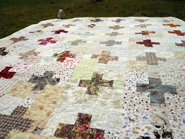
I wanted to make a neutral quilt to fit any elegant decor, but of course I could not make myself use only neutrals. So I pepped up the black, white, brown and beige fabrics with a thin, colourful scrappy strip here and there: I finished the above, Old Friends quilt early in 2013 and ten years later, I sewed one more almost-neutral quilt when I was writing the design into a pattern called Amity (available as an instant pdf download through the Tilkkunen webshop).
The pattern gives you the opportunity to put your small scraps into use and enjoy fast progress at the same time.
 I needed a flow from very light to very dark for my Jackpot quilt. The beige polka dot served well in its role:

 Massey Ferguson is a rare quilt for me because it’s one of the few that I’ve made after someone else's pattern. The yardage requirement was for three meters of both dark and light neutral. Because I tend to choose several different fabrics even when one would do, it is no wonder that my neutral purchases for the project were these:
 When I started on the Massey Ferguson quilt, I planned to match turquoises and oranges with a dark and light neutral. I chose to use beige predominantly as the light neutral that the design called for.
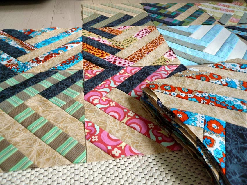 When you look at the finished Massey Ferguson quilt, you can see how the beige strips lift up not only the colours, but the dark neutrals and even the white fabrics, too:
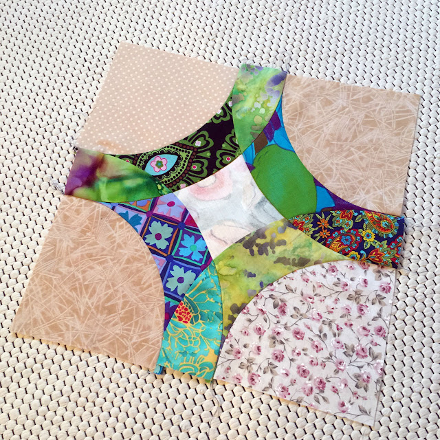
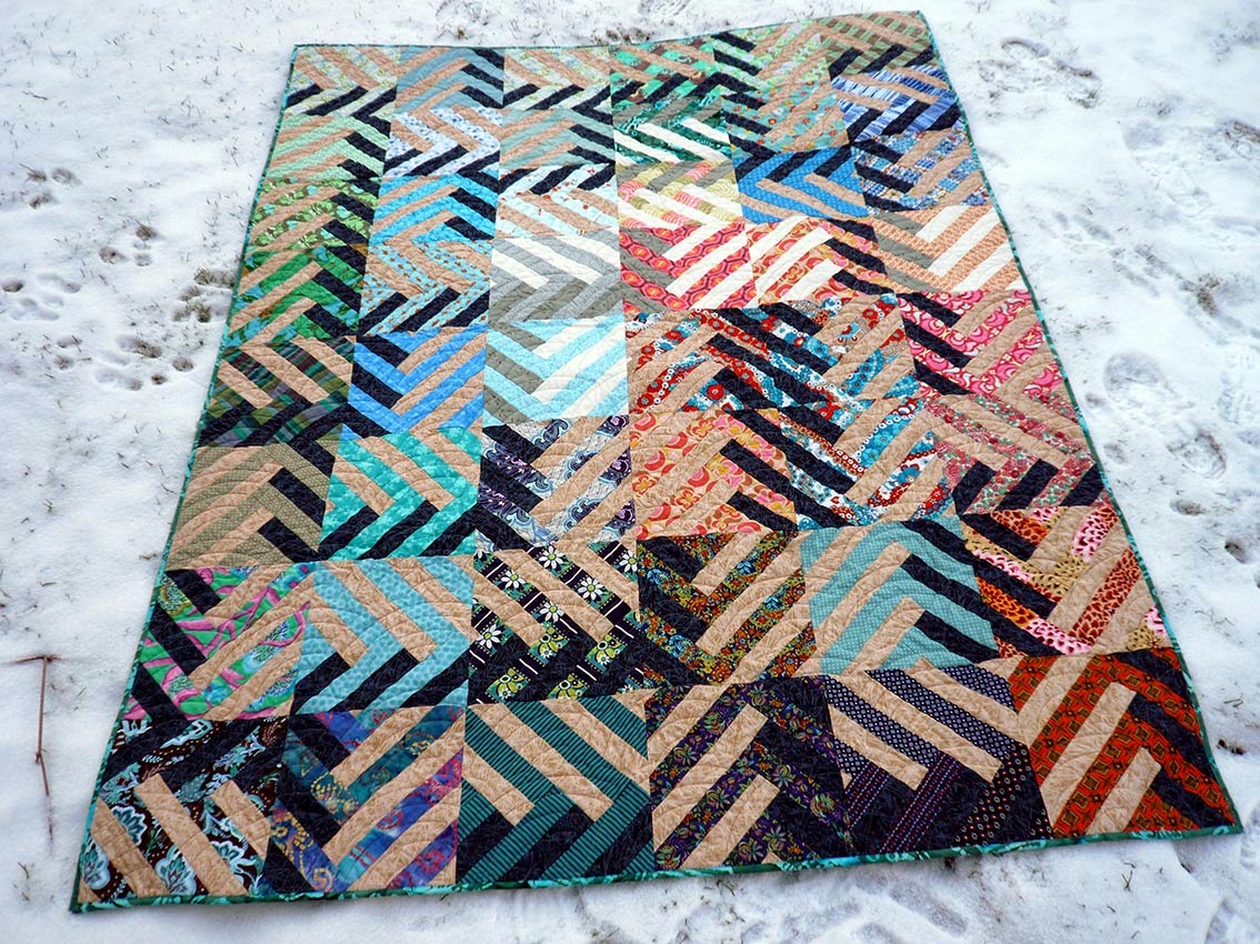 In 2016, I chose beige-ish as background for blue-green-purple-turquoises when I was making Lady Harvatine’s January quilt blocks (another rare one where I’ve used a pattern). This is one of the blocks:
 And here’s the finished quilt which I named Trip Around the World (though this quilt looks nothing like the similarly named popular pattern):
 For the Sleeping Beauty’s Daydream quilt in 2014, I chose a selection of pretty patterns, which I complemented with a beige polka dot fabric.

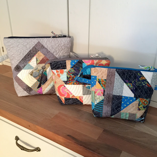
For the Soap Bubble Kitties zippered bag, I found a suitable beige to match the colours in the cats. The cool, pale blue and lilac colours get a great complement from the warmer beiges and browns: The Kobenhavn bucket bag has a simple shape, which the more elaborate quilted surface complements. You can see some leftover pieces from the Massey Ferguson quilt, and they look great next to the deep blue and the greyish blue:

I’ll be discussing another colour in two weeks' time, sharing tips and stories from my own quilts. If you want to be sure to get all my colour tips – and possibly other fun updates as well – you can subscribe to my biweekly newsletter.
- My thoughts and helpful tips about using beige colour in quilts
- What to watch out for, and ways to use beige effectively in quilting
- Practical examples from my own quilts and quilted items

What to watch out for when using beige in quilting
A quilt with an abundance of beige, especially if there isn’t much contrast may look and seem boring or drab because the colour is probably the most neutral of the colours that quilters call neutral.Because beige is a neutral, it will go with pretty much any colour as long as you remember value contrast: make sure that your colours are clearly lighter or darker than the beige fabrics next to them. The value contrast may seem clear when you are looking at your fabrics up close, but it is good to make sure.
For example, I once wanted to make a less colourful surface and combined whites and lights with beige. The result was pale and contrastless:
How to use beige successfully in quilting
Beige as an alternative to white
Beige is a soft, versatile neutral, and the palest beige fabrics can be an excellent alternative to clear white.If your quilt or block calls for white pieces, they don’t all have to be of the same fabric, or even white - you can also use beige. When you apply this sort of freedom and accept that blocks will not have a uniform colour, you reduce the risk of running out of a certain fabric.
Beige together with other neutrals
Sometimes even a friend of bright, multiple colours may need to make an understated quilt – when making a quilt to present to a stylish person, for example. Neutral colours are the safest bet for such a quilt.I wanted to make a neutral quilt to fit any elegant decor, but of course I could not make myself use only neutrals. So I pepped up the black, white, brown and beige fabrics with a thin, colourful scrappy strip here and there:
The pattern gives you the opportunity to put your small scraps into use and enjoy fast progress at the same time.

Beige as part of an ombré flow
Beige can work as part of an ombré design that flows from white to black. Here, for example:Beige combined with bright and pretty fabrics
Beige works as a great neutral background for bright colours. See how the predominantly beige fabric makes the tiny rectangles glow! No wonder I named this bag “Jungle Jewel”.
Using beige and temperature contrast
In addition to value and colour contrast, you can take advantage of temperature contrast – the difference between warm and cool colours. For example, a beige of a warm hue can work as an effective background for cooler-looking colours such as blues and purples.For the Soap Bubble Kitties zippered bag, I found a suitable beige to match the colours in the cats. The cool, pale blue and lilac colours get a great complement from the warmer beiges and browns:
My final thought about beige in quilting
Perhaps beige is bland on its own, and it would probably be near the bottom of my favourite colours list if I were to make one, but it has subtly been there in many of my successful quilts and quilted items, working in the background and helping my favourite, brighter colours shine.Earlier posts in the splendid colour tips series
I’ll be discussing another colour in two weeks' time, sharing tips and stories from my own quilts. If you want to be sure to get all my colour tips – and possibly other fun updates as well – you can subscribe to my biweekly newsletter.


Comments