Splendid colour tips for quilters: Blue colour in quilts
This is a modern quilting blog focused on patchwork, scrappy quilts, zipper pouches, quilted bags, colour theory, and practical quilting tutorials. This post is one of my Splendid colour tips series, where I share information to help you choose fabrics and colours for your quilts with more confidence.
In this post, I’ll share
 Did you know that blue is the most common favourite colour for women AND men? You can take advantage of this fact if you are making quilted items to sell.
Blue represents trust, safety, solidity, peacefulness and calm. Companies and banks often use blue as their brand colour, to create a sense of trustworthiness. You could also choose blue colour for a quilt that you want to give to a person you want to feel safe.
Blue is a cool colour and it often seems to recede towards the background when placed next to other colours.
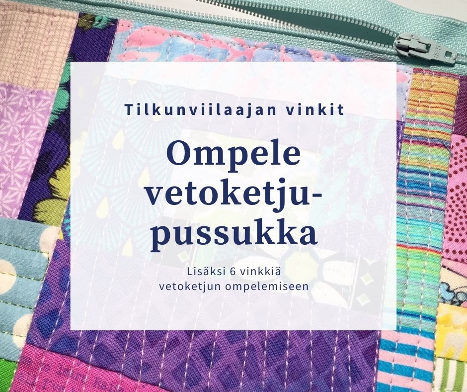
You may not like the result if you pair a really dark blue with a sharp, cold white. For a small detail, perhaps, but imagine a whole quilt in the extreme contrast as I’ve chosen for this zipper bag: Rather than automatically choose white for value contrasting with darker blue, you may want to explore a less harsh one, such as pale blue or very light bluish purple.
Blue is the traditional colour in jeans. We are probably familiar with the risk of the blue dye in denims bleeding, and there is another issue worth remembering: the fabric is thick and heavy. If you want to use denim scraps, you can make things easier for you if you always have regular quilting fabric scraps next to the denims. The seams don’t get as bulky that way.
Colour contrast alone is not necessarily enough – nor is pattern contrast. Many blue fabrics will look different up close – their patterns or hues may be wildly different – and yet, they can blend together when viewed from a distance if they are of the same value. It’s always a good idea to check that the parts of your quilt or block that should have contrast will indeed do so.
Because yellow is a high-intensity colour, it will have extreme colour contrast against blue. For a long time, I thought that all yellows are automatically of light value. (This is not so!) Because of this misconception, I chose blue and yellow for one of my early log cabin projects: I wouldn’t say that the finished creation was unsuccessful, but it would have looked more cohesive with a softer colour and value contrast.

 This quilt was problematic to begin with because of the clear whites and oh so many patterned fabrics, but the muted colours ruined it. I gathered the top into a plastic bag and kept it at the back of a closet for two years. Then I grabbed my friend, the seam ripper, and took out the offending blocks.
The finished Spectrolite/Spektroliitti quilt isn’t a masterpiece but at least it didn’t become part of a landfill! Trust me, it looks better in the photo than in real life:


 In particular, you could choose dark blue instead of black for the background parts of your quilt. The effect would be a little softer. And dark blue can bring interest into your quilt, or tone down your colourful, scrappy parts. This Peppy/Pirteä zipper pouch is an example:

Even though muddy browns (together with dark greens) may not be at their best when paired with brighter blues, a combination of paler browns and clear blues can be successful:
Of course nothing will stand out on an uniformly coloured surface and the viewer’s eye will have nowhere to stop and rest. People tend to skip over such quilt surfaces. An all blue quilt is easier to make interesting with the use of patterned fabrics, not only solids. When creating this post, I noticed that my favourite colour to combine with blue has been another blue! For example, Forget Me Not / Ethän minua unhoita quilt which features only blue fabrics: This was my original fabric pull for that quilt – and you can see that some of my choices identify as “blue” rather creatively.
 The creative interpretation of “blue” can also work as an interesting detail in your work. See that the mostly brown scrap works as “blue” in this block that became part of the Early to Rise / Aamuvirkku quilt:
 The Looking-glass Land / Peilimaa zipper pouch is another “all blue” creation of mine:
 Usually a quilt will benefit from order rather than chaos.
You will get order to your quilt surface if you apply a rule, and this rule can take many forms. You may choose a controlled or limited mix of colours – for example, limiting yourself to two colours plus a contrasting neutral.
See how the blue areas blend into purple and turquoise-green in this Gone with the Wind / Tuulen viemää quilt: The blue blocks in the middle of this Grandma’s House / Mummola quilt transform into the purple blocks that frame it, and from purple to the red blocks on the outer edge:
 The Upswing / Noususuhdanne quilt shows the blue-green and blue-purple shift even better:
 If you don’t want to use only blues in your quilt (or if you don’t find enough of them in your stash), complement your blue fabric pull with some suitably bluish purples. You can achieve a nice, harmonious quilt surface that doesn’t look boring. I used blues and purples in my art textile Soft Barbed Wire / Pehmeää piikkilankaa:

 On the other hand, you can take advantage of the extreme contrast and add a dash of orange into an otherwise blue surface:

When generating name ideas for an item, I did a Search “green and blue together” and as a bonus, learned that all languages do not have a different word for green and blue. For example, a source said that Welsh has a word for blue, and the same word was commonly used to describe the colour of sea, green or silver.
Perhaps it’s time to stop asking “Is this a pretty blue?” or “Do I think this blue fabric is beautiful” and ask “Should I use blue instead of black as my neutral this time?” or “Should I add a complementary colour to this blue block?” instead! Do you feel comfortable using blue in your quilts? What has been your most successful use of blue in a quilt? Let me know in the comments! I would love to hear from you!
I’ll be discussing other colours soon, sharing tips and stories from my own quilts. If you want to be sure to get all my colour tips – and possibly other fun updates as well – you can subscribe to my biweekly newsletter.
In this post, I’ll share
- My thoughts and helpful tips about using blue in quilts
- What to watch out for, and ways to use blue to effect in quilting
- Practical examples from my own quilts and quilted items

Blue represents trust, safety, solidity, peacefulness and calm. Companies and banks often use blue as their brand colour, to create a sense of trustworthiness. You could also choose blue colour for a quilt that you want to give to a person you want to feel safe.
Blue is a cool colour and it often seems to recede towards the background when placed next to other colours.
What to watch out for when using blue in quilting
Beware of the harsh contrast
Contrast does the work in quilts even though colour gets the credit. One might think therefore that a deeper value contrast means a better overall look, but it doesn’t work quite that way!You may not like the result if you pair a really dark blue with a sharp, cold white. For a small detail, perhaps, but imagine a whole quilt in the extreme contrast as I’ve chosen for this zipper bag:
Blue colour may bleed in the wash
There is another reason to avoid the very sharp contrast between pure white and dark blue: your dark blue fabric might bleed into the white in the wash. This could ruin your quilt.Blue is the traditional colour in jeans. We are probably familiar with the risk of the blue dye in denims bleeding, and there is another issue worth remembering: the fabric is thick and heavy. If you want to use denim scraps, you can make things easier for you if you always have regular quilting fabric scraps next to the denims. The seams don’t get as bulky that way.
Don’t rely on colour or pattern contrast alone
Blue often looks to recede into the background, and a colour like red may easily stand out next to it when you are looking at them up close. But even though the colour contrast is good, the value contrast may be poor, and the block pattern may not stand out when you look at your quilt surface from a distance.Colour contrast alone is not necessarily enough – nor is pattern contrast. Many blue fabrics will look different up close – their patterns or hues may be wildly different – and yet, they can blend together when viewed from a distance if they are of the same value. It’s always a good idea to check that the parts of your quilt or block that should have contrast will indeed do so.
Because yellow is a high-intensity colour, it will have extreme colour contrast against blue. For a long time, I thought that all yellows are automatically of light value. (This is not so!) Because of this misconception, I chose blue and yellow for one of my early log cabin projects:
Watch out for blue blending into darks
Dark blue will easily blend into other dark colours such as black, grey or brown when viewed from a distance, and you should also check that your bright blues will have enough value contrast with your dark background:Your bright blues may not look great with muddy colours
One of my quilts nearly did not happen because I added blocks in brownish greens and other muddy colours to a project where most blocks were bright blue with mostly white as contrast:The finished Spectrolite/Spektroliitti quilt isn’t a masterpiece but at least it didn’t become part of a landfill! Trust me, it looks better in the photo than in real life:
Blue cannot compete with red, a high-intensity colour
Red is a high-intensity colour, and if you do not watch out, it will draw all the attention and blues will be left with a minor, supporting role, like in this Hello / Haloo quilt:Blue with red and white may look flag-ish
If you choose blue, red and white for your project, the combination may bring to mind some national flags. This may not be your intention – like it was mine when I combined those colours for a zipper bag inspired by the Norwegian flag:Ways to use blue colour successfully in a quilt
Blue can work as a neutral
As said, blue colour often seems to recede towards the background. That’s why it is a nice colour to use to set off colourful blocks, or colourful parts of blocks. A “neutral” background doesn’t necessarily have to be black, white or grey.Combining blue with browns – a good idea?
Years ago, combining blue and brown in an outfit was a strict no-no. Those times have passed, and perhaps never existed in quilting. Blue and brown can be an excellent combination!Even though muddy browns (together with dark greens) may not be at their best when paired with brighter blues, a combination of paler browns and clear blues can be successful:
Blue goes so well with other blues!
You may think that a quilt or a quilted item needs to include at least two colours to be successful. However, it is possible to achieve an interesting quilt surface using a single colour.Of course nothing will stand out on an uniformly coloured surface and the viewer’s eye will have nowhere to stop and rest. People tend to skip over such quilt surfaces. An all blue quilt is easier to make interesting with the use of patterned fabrics, not only solids. When creating this post, I noticed that my favourite colour to combine with blue has been another blue! For example, Forget Me Not / Ethän minua unhoita quilt which features only blue fabrics:
You will get order to your quilt surface if you apply a rule, and this rule can take many forms. You may choose a controlled or limited mix of colours – for example, limiting yourself to two colours plus a contrasting neutral.
Blues and greens together
The Grass Is Greener / Ruoho on vihreämpää quilt is an example of order brought by rules. The center squares in the blocks are always ”green” the edge pieces blue, and the sashings are neutral cream:Take advantage of blue’s analoguous colours
Analoguous colours are next to each other in the colour wheel. Blue is next to green and to purple on its other side, and you can take advantage of these relationships when developing colour areas in your quilt.See how the blue areas blend into purple and turquoise-green in this Gone with the Wind / Tuulen viemää quilt:
Orange and blue – complementary colours
Because blue and orange are complementary colours, their colour contrast is extreme. You can tone down the contrast if you add a scrap between them that elegantly combines both colours:Final reflections on blue in quilting
Blue is an interesting colour!When generating name ideas for an item, I did a Search “green and blue together” and as a bonus, learned that all languages do not have a different word for green and blue. For example, a source said that Welsh has a word for blue, and the same word was commonly used to describe the colour of sea, green or silver.
Perhaps it’s time to stop asking “Is this a pretty blue?” or “Do I think this blue fabric is beautiful” and ask “Should I use blue instead of black as my neutral this time?” or “Should I add a complementary colour to this blue block?” instead!
Earlier posts in the splendid colour tips series
I’ll be discussing other colours soon, sharing tips and stories from my own quilts. If you want to be sure to get all my colour tips – and possibly other fun updates as well – you can subscribe to my biweekly newsletter.


Comments