Looking back: the Early to Rise quilt from 2015
Today, I’ll share some of my “quilt thinking” and reflections on one of my earlier quilts.
If you saw the post about my favourite quilts, you may remember the Early to Rise / Aamuvirkku quilt which I finished in 2015. I sewed it according to the free tutorial/pattern “Geese Migration” by Cynthia Brunz. I had four good reasons to be inspired by the tutorial/pattern:
If you saw the post about my favourite quilts, you may remember the Early to Rise / Aamuvirkku quilt which I finished in 2015. I sewed it according to the free tutorial/pattern “Geese Migration” by Cynthia Brunz.

- It gave me an opportunity to use scraps – though not extensively
- The pattern uses a neutral for background
- Even though the block repeats across the surface, the colours do not. I did not have to make many similar blocks (and indeed, all my blocks were different)
- The pattern uses a sew-and-flip method for making the flying geese block. Before this, I had only made them of two half-square triangles
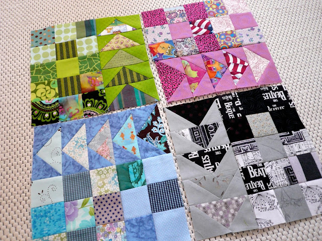
When I look at the Early to Rise / Aamuvirkku quilt now, I immediately see that many of the flying geese blocks do not have enough value contrast: their colours blend into each other, and the block loses definition. The problematic blocks look more like patterned rectangles.
 For example, the flying geese triangle that features Beatles fabric blends visually into the black corners:
 Another example: see how one of the green flying geese has practically no value contrast, and the block looks almost uniformly green:
 Though some of the blocks have problems with value contrast, I think that I just wasn’t being strict enough about it. I must have had a rudimentary understanding of value contrast. For example, I had first chosen a light grey fabric instead of the creamy white for the background, but according to a post that I shared during the process, noticed that “there was not enough contrast”.
However, though the lack of contrast in the flying geese blocks bothers me, the occasional lack of contrast between the squares in the big blocks does not. The squares are colourful and fun, and they would set off the flying geese blocks perfectly if I had managed to make the geese stand out from the background.
Back then, I had not yet properly recognised my favourite design process, namely sewing enough blocks for a quilt, then arranging them into a pleasing (enough) design. That’s why I want to congratulate my earlier self for following that process all the same. I chose the colours for the blocks at random, based on which solids (or fabrics that would read pretty much as solids) I happened to have in my stash.
In addition to being stricter about value contrast, today’s me would probably organise the blocks more by value than I did then. Overall, though, my current and former self think that the Early to Rise quilt looks great.
Soile from Töölön Tilkkupaja quilted the Early to Rise quilt beautifully on her longarm machine. The quilting pattern and the scrappy binding are two more design decisions that I still applaud! Here’s a detail of the scrappy binding strip: Here is the Finnish-language post announcing the Early to Rise / Aamuvirkku quilt finish in 2015.
If you want to follow my monthly Looking back posts, what I’m working on and what I’ve finished (and get some quilting tips, too), you can subscribe to my biweekly newsletter here: https://tilkunviilaaja.blogspot.com/p/subscribe-today.html

However, though the lack of contrast in the flying geese blocks bothers me, the occasional lack of contrast between the squares in the big blocks does not. The squares are colourful and fun, and they would set off the flying geese blocks perfectly if I had managed to make the geese stand out from the background.
Back then, I had not yet properly recognised my favourite design process, namely sewing enough blocks for a quilt, then arranging them into a pleasing (enough) design. That’s why I want to congratulate my earlier self for following that process all the same.

In addition to being stricter about value contrast, today’s me would probably organise the blocks more by value than I did then. Overall, though, my current and former self think that the Early to Rise quilt looks great.
Soile from Töölön Tilkkupaja quilted the Early to Rise quilt beautifully on her longarm machine. The quilting pattern and the scrappy binding are two more design decisions that I still applaud! Here’s a detail of the scrappy binding strip:
Two things I’ve learned since making Early to Rise
- I still like my 2015 version of the Geese Migration tutorial/pattern. Perhaps a remake would look better, perhaps not! But at least today, I’m better able to organise a randomly coloured set of blocks into a pleasing design because I’ve done that so many times.
- I also understand how important value contrast is and would make all my flying geese blocks with clear contrast.
If you want to follow my monthly Looking back posts, what I’m working on and what I’ve finished (and get some quilting tips, too), you can subscribe to my biweekly newsletter here: https://tilkunviilaaja.blogspot.com/p/subscribe-today.html


Comments