Splendid colour tips for quilters: Using white in quilts
This post is one of my Splendid colour tips series, where I share information to help you choose fabrics and colours for your quilts with more confidence. In this post, I’ll share:
 White is categorised as an achromatic colour together with black and grey. They are void of colour, and we quilters usually call them “neutrals”.
Western cultures associate white with purity, innocence, and peace – but in Italy, white is the colour for funerals. In Eastern cultures, white can mean death, grief, or misfortune.
Though our associations with white can be mixed, it is still an extremely common neutral to use in quilts. Modern quilts, in particular, may have a lot of white space.
The opaqueness has a second risk: any darker threads may also show through the white fabrics. So you may want to be extra careful when cleaning up those small pieces of thread from the wrong side of your quilt surface and from the batting. If you aren’t, you may have to remove the threads from the finished quilt (I’ve heard that a small crochet hook is a suitable tool for this).
White fabrics are where the possible colour run from other parts of the quilt will show up. It is a delicate colour in other ways, too. If you quilt a largely white piece by hand, you may have to put the piece through a wash right after you’ve finished it.
If your quilt features large areas of white, you may want to choose an interesting quilting pattern, or at least make sure that those areas are quilted densely enough. Otherwise, the white areas may seem empty.
In 2022, I came up with a block design which later resulted in me designing a commercial quilt pattern, Lexical. It, too features a colourful combination of patches on a white or nearly white background: (That image shows again how I use all kinds of lights flexibly instead of white if need be. The main point is to achieve good value contrast!)
In the block layout phase, a few of my readers noticed that they would create a secondary pattern of rather a large white square: That is why the Lexical pattern features two options: with or without dark corners. Here you can see how some dark-cornered blocks look together:
 Because many national flags have white in them, certain colour combinations in particular hues may bring those flags to mind. Watch out for that if you aren’t making a flag-inspired quilt.
White tends to tone down the colours next to it. Even deep colours may end up looking more subdued than you’d think. My Michaelmas Daisies / Elokuunasterit quilt from 2021 is an example of this.
The project started as colourful. I had picked gorgeous, purple and green fabrics for the project. The colours were deep and looked so good together. Now look at the finished quilt! As you can see, my lovely blocks no longer look luscious. Instead, the finished quilt has an oddly washed-out look:
 Another example were the small four-patches that I was going to pair with white-on-white squares. The whole quilt design was meant to alternate the four-patches and squares, but it didn’t take me long to notice that again, there was too much white for the bright colours to really shine:
 I decided to use the already sewn part only for the middle of the quilt and surround that area with my colourful four-patches. I had to make more of them than I’d originally calculated, but the resulting Random Deals / Sattumankauppaa quilt pleased my eye at the end.
 A pure, bright white can have a cold feel; perhaps it is because it reminds us of snow. If you combine such bright whites with cool-coloured fabrics – like blues – the resulting surface will have a cool feel. My 22 Words for Snow / Lumen 22 nimeä doll’s quilt, for example, looks very winter-y:
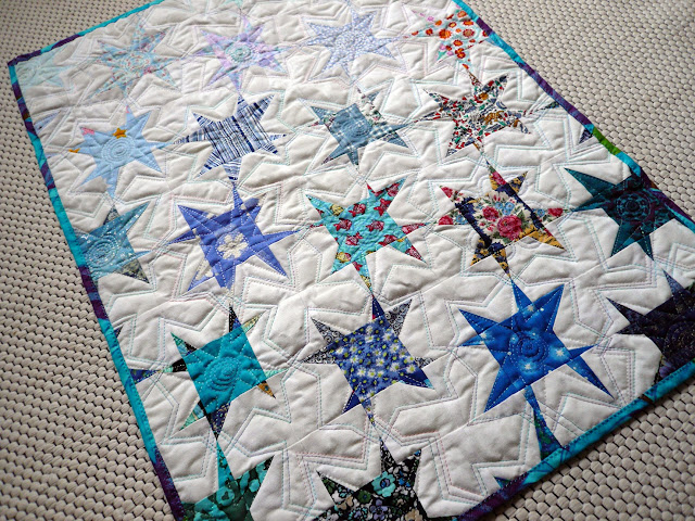 (If you are interested in the 22 different Finnish words for snow that I could easily come up with, you will find the list with English translations in this post where I introduced the finished doll’s quilt.)
Because some whites look and feel cold, the consequence is that a surface featuring a lot of such whites will not easily look soft and warm. If you are seeking a warmer look, you may want to choose softer, warmer whites or even light beige fabrics instead.
Lastly, many quilters are particular about matching their white fabrics. It is true that a pure white patch can make an off-white patch look dirtyish if they are placed next to each other. But you can’t really tell that there are different whites if you look at the finished Colour Energy / Värienergiaa quilt:
 As said, white often gives a modern feel to a quilt, and a suitable amount of white can also look fresh.
Because the Michaelmas Daisies quilt with its washed-out look was such a disappointing project for me, I’ve since been extremely cautious and avoided creating white expansed to my quilts. This caution was the reason for me also to pick lights, not only whites for the blocks I made into the Stellar Material / Tähtiainesta quilt. It would have been easier for me just to use white – and the same white – fabric for all blocks, but I didn’t want that.
This image shows that the light parts of the spring-green block are pale green, not white at all. And the partly visible block in the bottom corner uses pale grey in its light parts: Last year, in 2025 I decided to make two different quilts that would have 2,5” squares in common. One of them featured a white background and the other one used black or nearly black. I really wanted to find out if the white would make my colourful squares look washed out or if I’d be able to achieve the right balance, establishing a modern look.
Luckily I succeeded, and my Curious quilt looks colourful, not pale: In 2011, I sewed a small quilted handbag called Karaoke. I got the idea from an image I saw in a book. Karaoke is probably the whitest quilted item I’ve ever sewn!

I’ll be discussing other colour topics soon, sharing tips and stories from my own quilts. If you want to be sure to get all my colour tips – and possibly other fun updates as well – you can subscribe to my biweekly newsletter.
(When subscribing, remember to take the second step: you will get an email asking you to confirm. My emailing system can only send you the newsletters if you have clicked on the button in that email.)
- My thoughts and helpful tips about using white in quilts
- What to watch out for, and ways to use white to effect in quilting
- Practical examples from my own quilts and quilted items

Western cultures associate white with purity, innocence, and peace – but in Italy, white is the colour for funerals. In Eastern cultures, white can mean death, grief, or misfortune.
Though our associations with white can be mixed, it is still an extremely common neutral to use in quilts. Modern quilts, in particular, may have a lot of white space.
What to watch out for when using white in quilts
White areas in your quilt may sometimes be less than opaque. Then, if you choose a very low-loft batting, a darker quilt back may show through those white areas. This may not bother you, but you may still want to avoid the risk.The opaqueness has a second risk: any darker threads may also show through the white fabrics. So you may want to be extra careful when cleaning up those small pieces of thread from the wrong side of your quilt surface and from the batting. If you aren’t, you may have to remove the threads from the finished quilt (I’ve heard that a small crochet hook is a suitable tool for this).
White fabrics are where the possible colour run from other parts of the quilt will show up. It is a delicate colour in other ways, too. If you quilt a largely white piece by hand, you may have to put the piece through a wash right after you’ve finished it.
If your quilt features large areas of white, you may want to choose an interesting quilting pattern, or at least make sure that those areas are quilted densely enough. Otherwise, the white areas may seem empty.
In 2022, I came up with a block design which later resulted in me designing a commercial quilt pattern, Lexical. It, too features a colourful combination of patches on a white or nearly white background:
In the block layout phase, a few of my readers noticed that they would create a secondary pattern of rather a large white square:
White tends to tone down the colours next to it. Even deep colours may end up looking more subdued than you’d think. My Michaelmas Daisies / Elokuunasterit quilt from 2021 is an example of this.
The project started as colourful. I had picked gorgeous, purple and green fabrics for the project. The colours were deep and looked so good together.
Because some whites look and feel cold, the consequence is that a surface featuring a lot of such whites will not easily look soft and warm. If you are seeking a warmer look, you may want to choose softer, warmer whites or even light beige fabrics instead.
Lastly, many quilters are particular about matching their white fabrics. It is true that a pure white patch can make an off-white patch look dirtyish if they are placed next to each other.
Ways to use white successfully in a quilt
You are allowed to use different whites in the same quilt – and you can train your eye to accept the differences in their hues. When your quilt is finished, the subtly (or not so subtly) different shades of white aren’t usually noticeable, or at least not disturbing. This image shows that I’ve used a variety of whites in my blocks:Because the Michaelmas Daisies quilt with its washed-out look was such a disappointing project for me, I’ve since been extremely cautious and avoided creating white expansed to my quilts. This caution was the reason for me also to pick lights, not only whites for the blocks I made into the Stellar Material / Tähtiainesta quilt. It would have been easier for me just to use white – and the same white – fabric for all blocks, but I didn’t want that.
This image shows that the light parts of the spring-green block are pale green, not white at all. And the partly visible block in the bottom corner uses pale grey in its light parts:
Luckily I succeeded, and my Curious quilt looks colourful, not pale:

Earlier posts in the splendid colour tips series
In case you have missed some of my colour tips, here is a comprehensive list:- Using multicoloured, patterned fabrics
- Fashionable colours in quilts
- Colour palettes
- Using just one colour
- Beige colour in quilts
- Pink colour in quilts
- Blue colour in quilts
- Using black in quilts
- Red colour in quilts
- Purple colour in quilts
- Grey colour in quilts
- Yellow colour in quilts
- Brown colour in quilts
- Turquoise colour in quilts
- Orange colour in quilts
I’ll be discussing other colour topics soon, sharing tips and stories from my own quilts. If you want to be sure to get all my colour tips – and possibly other fun updates as well – you can subscribe to my biweekly newsletter.
(When subscribing, remember to take the second step: you will get an email asking you to confirm. My emailing system can only send you the newsletters if you have clicked on the button in that email.)


Comments