Splendid colour tips for quilters: Fashionable colours in quilts
Quilting fabric colours also follow fashion trends, though the changes aren’t as rapid as in the garment industry. And why wouldn't they? Like all new things, new fabrics are tempting, as we all know (too well)! In this post, I'll share my thoughts of fashionable colours in quilts, and at the end, I will give the promised tips related to the topic.
 Though many of us quilters follow the current quilting fabric trends, many choose to go against them and favour "old-fashioned" fabrics by choice. Some popular colour/pattern schemes include the so-called “Civil War” and “1930s” fabrics, and there are quilters who purchase vintage bedsheets to create lovely 1970s themed quilted items.
For example, my quilty friend Soile created her Ursula quilt – which in this photo is still a surface – and used many Civil War reproduction fabrics whose colours and patterns were invented a long time ago: She also used other than those reproduction fabrics and achieved a perfect combo of old-fashioned and current feel.
It's now year 2026, and this year’s colour, “Cloud Dancer,” is a perplexing choice. According to the team, it is “a billowy white imbued with serenity”. In other words, the colour of the year is WHITE, which in essence is an absence of colour. In their description of white Cloud Dancer as a great choice, the Pantone team refer to "a world where color has become synonymous with personal expression”. And when I first read about this “colour” of the year, I understood that with this choice, the team wanted to "introduce calm into the overly multicoloured world". These statements make me wonder even more than their “colour” choice.

For example, my quilty friend Soile created her Ursula quilt – which in this photo is still a surface – and used many Civil War reproduction fabrics whose colours and patterns were invented a long time ago:
Colour of the Year
Pantone is a big name in the colour industry, and they annually introduce the Colour of the Year. Their colour in 2025 was Mocha Mousse, which was described as a “warming, brown hue imbued with richness”.It's now year 2026, and this year’s colour, “Cloud Dancer,” is a perplexing choice. According to the team, it is “a billowy white imbued with serenity”. In other words, the colour of the year is WHITE, which in essence is an absence of colour.

After all, the world has become increasingly less colourful than before.
And there is proof: the percenteage of colour pixels in images. As recently as in the 1960s, 80% of the pixels in images and pictures were colours. In the 2020s, only 60% of the pixels are colours. Source: https://www.theculturist.io/p/why-is-the-world-losing-color
I used to see quilting challenges related to colours of the year, but this year, in 2026, I haven’t seen any. Have you?
On the other hand, it’s no wonder if there haven’t been many Cloud Dancer challenges, because we consider that whites and nearly whites are neutrals. And neutrals are usually added to the quilt so that the colours can shine.
If Cloud Dancer makes me shake my head disbelievingly, I have to say that some of Pantone’s earlier choices haven’t looked exactly like winners either. For example, the year 2021 didn't have just one, but two colours – grey and yellow. Which to me looked sad together.
Here are all Pantone colours of the year 2000-2026.
Here’s a picture I picked from Internet and used to create a colour palette. I don't remember a similar colour combination from the 1970s but looking at it today, it does look typical of the decade, doesn’t it? The 1970s has only a faint role in any of my quilted items. I could only find two tiny examples.
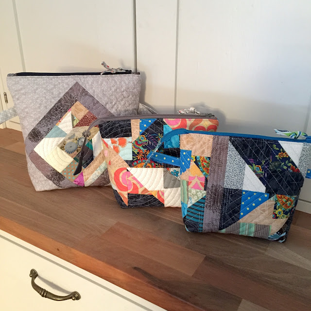
This is the Fiftari zipper pouch, and it features a folded “flower shape” of a genuine 1970s bedsheet fabric:
The 1970s has only a faint role in any of my quilted items. I could only find two tiny examples.
This is the Fiftari zipper pouch, and it features a folded “flower shape” of a genuine 1970s bedsheet fabric:
 A bigger piece of another 1970s sheet ended up as a backing for the Syyssatoa zipper pouch panel. I’m surprised to see that I’ve chosen to run such elaborate quilting – it reminds me of chrysanthemums. This may have been the last time I’ve attempted such a free-motion quilting pattern!

The palette in this picture would represent my own colours back in the day, except that I tended to wear black more often than any of those lovely colours. The 1980s must have filled my quota of black-wearing because since then, I’ve rarely bought any black clothes – and I even have to force myself to buy something solid-coloured. My favourite colour is many colours together!
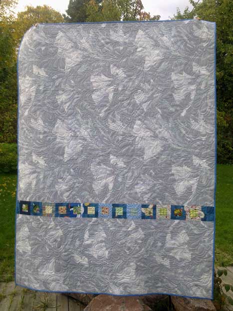 I bought the greyish fabric for a curtain for our newly renovated kitchen then, and more recently, found it perfect to reuse for the backing of the Grass Is Greener (Ruoho on vihreämpää) quilt from 2012.
The 1990s was the time when quilting became popular in Finland. Many quilters favoured fabrics in sort of in-between colours, and featuring small flowers as patterns. Other kinds of cottons were difficult to find in Finnish fabric stores.
The following are two images of fabrics that I remember looking at, perhaps even chosen. Though today, none of them would be my #1 choice to add to my cart, not to mention to my quilt surface...
 The dominant fabric in this block-in-progress looks so 1990s, but the contrasting scrappy strip brings it back to the 2020s:
 This picture was taken either in the 1990s or very early in the 2000s, but whatever the date was, this small wall hanging has a definite 1990s feel!

As a rule, some colour combinations and patterns look unexplainably dated, and they tend to represent the recently top-top-popular fashions that have just recently gone out of fashion.
Fashion is a funny thing – one tends not to recognise the essence of current fashion until afterwards. When a fabric in your stash starts to feel unpleasant, it is often because it has been very fashionable but isn’t any more.
(You may also be turned off by a fabric if you’ve bought “enough” of it at the time and now it seems to be a never-ending piece that you must use it again and again.)
If you do recognise that a quilting fabric has a top-fashionable colour or pattern, you may want to leave it in the store. After all, it won’t take forever to see that it’s lost all its charm. Top fashion will inevitably go out of fashion eventually, and this includes quilting fabrics.
Or – perhaps rather – get a small amount of that top-fashionable fabric. Perhaps an amount that feels like too little. You may be able to use it all while the fabric still has a feeling of “new and fashionable”.
Second tip: whether you buy fashionable or timeless fabrics, use your stash! Your lovely fabrics will not bring others as much joy as they bring you.
In 2015, my friend Soile and I bought a mystery box full of fabrics and sorted them into small, colour-coordinated bundles to sell and benefit our quilting guild. The fabrics were all from the 1990s or earlier and left over when their owner no longer needed them. They had probably been waiting on a shelf or a box for a decade to be used. It was a treasure for us, but at the same time, we felt sad.
“...color doesn’t have to mean disorder. It doesn’t have to undermine seriousness. And indeed, the reflex to strip it away may reveal more about our cultural discomfort than our aesthetic taste. For when we mute our surroundings, we risk muting ourselves.”
“It’s time to bring color back.”
Here’s my response today to this call to action: the Goodwill Among Neighbours quilt from 2022: Dear fellow quilters, you and I are living in a world of real colours. Let our colour flags fly high!
I’ll be discussing other colours soon, sharing tips and stories from my own quilts. If you want to be sure to get all my colour tips – and possibly other fun updates as well – you can subscribe to my biweekly newsletter.
(When subscribing, remember to take the second step: you will get an email asking you to confirm. My emailing system can only send you the newsletters if you have clicked on the button in that email.)
And there is proof: the percenteage of colour pixels in images. As recently as in the 1960s, 80% of the pixels in images and pictures were colours. In the 2020s, only 60% of the pixels are colours.
I used to see quilting challenges related to colours of the year, but this year, in 2026, I haven’t seen any. Have you?
On the other hand, it’s no wonder if there haven’t been many Cloud Dancer challenges, because we consider that whites and nearly whites are neutrals. And neutrals are usually added to the quilt so that the colours can shine.
If Cloud Dancer makes me shake my head disbelievingly, I have to say that some of Pantone’s earlier choices haven’t looked exactly like winners either. For example, the year 2021 didn't have just one, but two colours – grey and yellow. Which to me looked sad together.
Here are all Pantone colours of the year 2000-2026.
The seventies!
Some of you readers will remember the colours in the 1970s. I embraced them then like everyone else, but when years passed, I started to dislike those combinations more and more. Now the 1970s are such ancient history that I’ve regained some tolerance, and at least those colours look more cheerful by far than the popular black-grey-white-brownish garment colours that seem to be prevalent today.Here’s a picture I picked from Internet and used to create a colour palette. I don't remember a similar colour combination from the 1970s but looking at it today, it does look typical of the decade, doesn’t it?
The eighties!
How about the 1980s with electric blues and neon colours busting the bank? Oh lovely times!The palette in this picture would represent my own colours back in the day, except that I tended to wear black more often than any of those lovely colours.
The nineties!
Shocking pinks and blues gave way to more sedate hues of the 1990s. This quilt back features fabric that was top fashion at the turn of the decade:The 1990s was the time when quilting became popular in Finland. Many quilters favoured fabrics in sort of in-between colours, and featuring small flowers as patterns. Other kinds of cottons were difficult to find in Finnish fabric stores.
The following are two images of fabrics that I remember looking at, perhaps even chosen. Though today, none of them would be my #1 choice to add to my cart, not to mention to my quilt surface...
Fabrics and fashion
Quilting fabrics do not exist outside fashion. Certain colours and combinations look “in” and “with the times” – and some are timeless.As a rule, some colour combinations and patterns look unexplainably dated, and they tend to represent the recently top-top-popular fashions that have just recently gone out of fashion.
Fashion is a funny thing – one tends not to recognise the essence of current fashion until afterwards. When a fabric in your stash starts to feel unpleasant, it is often because it has been very fashionable but isn’t any more.
(You may also be turned off by a fabric if you’ve bought “enough” of it at the time and now it seems to be a never-ending piece that you must use it again and again.)
What to watch out for when using fashionable colours and fabrics
It took me an enormous effort, but I made it: I found two tips to offer you related to fabrics in fashion.If you do recognise that a quilting fabric has a top-fashionable colour or pattern, you may want to leave it in the store. After all, it won’t take forever to see that it’s lost all its charm. Top fashion will inevitably go out of fashion eventually, and this includes quilting fabrics.
Or – perhaps rather – get a small amount of that top-fashionable fabric. Perhaps an amount that feels like too little. You may be able to use it all while the fabric still has a feeling of “new and fashionable”.
Second tip: whether you buy fashionable or timeless fabrics, use your stash! Your lovely fabrics will not bring others as much joy as they bring you.
In 2015, my friend Soile and I bought a mystery box full of fabrics and sorted them into small, colour-coordinated bundles to sell and benefit our quilting guild. The fabrics were all from the 1990s or earlier and left over when their owner no longer needed them. They had probably been waiting on a shelf or a box for a decade to be used. It was a treasure for us, but at the same time, we felt sad.
Final words on colour
This is the conclusion in the Why is the world losing color article:“...color doesn’t have to mean disorder. It doesn’t have to undermine seriousness. And indeed, the reflex to strip it away may reveal more about our cultural discomfort than our aesthetic taste. For when we mute our surroundings, we risk muting ourselves.”
“It’s time to bring color back.”
Here’s my response today to this call to action: the Goodwill Among Neighbours quilt from 2022:
Earlier posts in the splendid colour tips series
I’ll be discussing other colours soon, sharing tips and stories from my own quilts. If you want to be sure to get all my colour tips – and possibly other fun updates as well – you can subscribe to my biweekly newsletter.
(When subscribing, remember to take the second step: you will get an email asking you to confirm. My emailing system can only send you the newsletters if you have clicked on the button in that email.)


Comments