They can’t all be winners: 5 quilting projects I wouldn’t make again
A few weeks ago, I came across a blog post where a quilter shared a finish. She mentioned being vaguely unhappy with it even though there wasn’t anything wrong with the blocks and the design.
I’m pretty sure that most of us have experienced something similar. Looking at a quilty finish and thinking “this may be okay, but I am so done with this: never again”!
Of my around 640 quilting projects, these are five that I would not re-make. I’ve analysed the core reasons and shared my learnings.
Because I didn’t quite understand value contrast back then, many blocks had too much of it while others didn’t have enough. I used patterned fabrics which read darker than I thought. But the beginning was promising all the same: Then, something – perhaps a lack of fabric variety in certain colours – made me start using muddy colours in my blocks. Did I think that colour didn’t matter? Perhaps! The value contrast was mostly good, but the colours looked terrible in the final design.
 At least I was honest to myself at this point and paused the project. Because I hated it, I shoved it into the darkest corner of a closet, but I did not throw it away! And 3,5 years later, I had recovered enough to pick up the quilt surface again and correct it.
There are two reasons why I would not re-make this project. Firstly, I cannot re-make it because I’ve lost the block instructions. Secondly, the mere thought of working on something similar to this disturbingly awful project makes me shudder.
The key learning for me from the Spectrolite project is to be more careful with value contrast and with the interaction between the fabric colours, hues and patterns.
Eventually, I took up the four-patches and decided to add corners to them. I just could not find suitable fabrics (solids) in my stash, and even the mildest of my patterned fabrics looked wrong, so I bought short yardages of several Grunge fabric colours and used them.
I don’t remember if I had a particular vision – perhaps I was dreaming of achieving an ombré type of background where one colour would flow smoothly into another. (It would have been impossible with those colours, but dreams aren’t always realistic.) Or maybe I just thought of embracing something unfamiliar by using colours that I didn’t love.
The finished Witness quilt looks like someone else made it: The colours aren’t unpleasant, the four-patches look nice, and the quilting pattern adds to the overall design. And yet, perhaps it is the bold colours and the symmetry of the design that look so “not me”.
My learning: I will not be attempting an ombré flow of block background colour value unless the background is of a single colour. I’ve learned now that I won’t like the effect. I will also think twice before creating larger areas in so many different, bold colours in a single quilt. Though I do like a scrappy, multi-coloured look, I probably don’t want such a colourful background for my scrappy blocks.
Perhaps the Witness quilt would have been nice if I’d only picked red fabrics for the background. Who knows? But I picked red, blue, purple, and green! It was just too much.
You see, spatial thinking is my weak point, and my blocks kept turning out wrong. I’m better with blocks that are all the same, and not “left-facing” and “right-facing”.
Here’s a progress shot. I had sewn four and four blocks together and realised that if I sewed them together, the secondary pattern would not turn out right: While I was picking and cutting fabrics for the blocks, the process was fine, but the construction phase was exhausting. It took too much mental energy to ensure I was making the right kind of blocks!
Because of my process, the project took more than three years. Here’s the finished Wind's Nests quilt: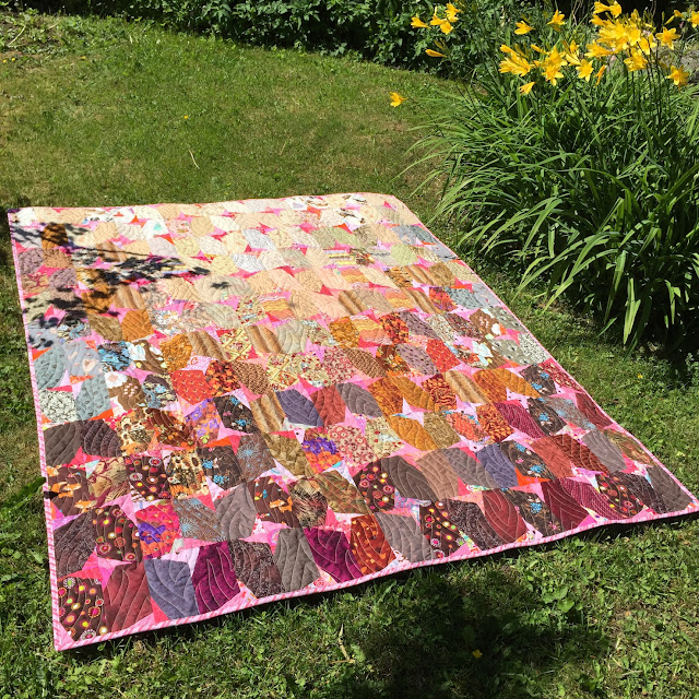 Though the Wind’s Nests quilt turned out quite nice, I would not make it again because the process of making it was so tedious. There were so many things that I had to get right, too. The right/left orientation combined with the many directional prints that I used was a challenge.
The learning from this quilt is to pause after making a few blocks and consider if I feel frustrated by the process or the technique. And re-think whether I want to continue with the project. Perhaps that is not how I want to use my quilting energy.
As usual, I quilted the surfaces onto a piece of batting. And without thinking, I added a piece of sweatshirt material between the scrappy surface and the batting. There was nothing unusual about that as such, but I was making a Hejsan series pouch.
The combination of flat shape, small size and three layers of material, some of it thick, resulted in an awkward-looking zipper pouch. My learning from this project is that the material must match the shape and size of the item. A small zipper bag won’t look right if sewn of bulky material.
The zipper pouch itself was not to blame – hence the name Blameless – and I won’t abandon the Hejsan series. I will just do my best to remember the learning from this project and never make the same mistake again.
I was very motivated and had brought a photo of a peony with me, and scraps in all shades of pink and red. When I started, I felt confident that I could make a beautiful fabric painting. I would conjure up a peony and fill in the background with green peony leaves and stems. This is where I ran out of faith: It looks better in the picture.
The learning from this project is that I’m not comfortable creating pictorial quilts using freeform pieces in an improvisational way. I like drawing and used to be pretty good at it, but “drawing” with small pieces of fabric this way is not my thing.
I will continue admiring people who create beautiful pictures using this technique, but this is not the kind of making that I’m interested in. And that is ok!
They can’t all be winners, but the definition of “a winner” depends on the person. If the finished quilt looks “meh” to you, someone else may like it (or even love it)!
And at the very least, a less than successful project will give you ideas about what you DON’T like – and what you do like. How much contrast looks good to you, what kinds of backgrounds you prefer, what kind of process and which techniques feel right.
So – if a quilt leaves you feeling a bit disappointed, perhaps look at it with curiosity rather than guilt and find out what it taught you.
I’m pretty sure that most of us have experienced something similar. Looking at a quilty finish and thinking “this may be okay, but I am so done with this: never again”!
Of my around 640 quilting projects, these are five that I would not re-make. I’ve analysed the core reasons and shared my learnings.
Spectrolite: Problems all along
Many years ago, I enjoyed a fun sew-together Saturday with my quilting guild. One of us shared a clever sew-and-cut method for creating a quilt block. I’d seen a quilt that she had made and oh, it looked so good! I wanted to make something as nice as that one!Because I didn’t quite understand value contrast back then, many blocks had too much of it while others didn’t have enough. I used patterned fabrics which read darker than I thought. But the beginning was promising all the same:
There are two reasons why I would not re-make this project. Firstly, I cannot re-make it because I’ve lost the block instructions. Secondly, the mere thought of working on something similar to this disturbingly awful project makes me shudder.
The key learning for me from the Spectrolite project is to be more careful with value contrast and with the interaction between the fabric colours, hues and patterns.
Witness: Too bold for me
In 2024, I worked on the Between the Darkness and the Light quilt, which features squares and four-patch blocks set on the diagonal. I overestimated my need for blocks and when the layout was ready, I had a very large number of leftover pieces.Eventually, I took up the four-patches and decided to add corners to them. I just could not find suitable fabrics (solids) in my stash, and even the mildest of my patterned fabrics looked wrong, so I bought short yardages of several Grunge fabric colours and used them.
I don’t remember if I had a particular vision – perhaps I was dreaming of achieving an ombré type of background where one colour would flow smoothly into another. (It would have been impossible with those colours, but dreams aren’t always realistic.) Or maybe I just thought of embracing something unfamiliar by using colours that I didn’t love.
The finished Witness quilt looks like someone else made it:
My learning: I will not be attempting an ombré flow of block background colour value unless the background is of a single colour. I’ve learned now that I won’t like the effect.
Perhaps the Witness quilt would have been nice if I’d only picked red fabrics for the background. Who knows? But I picked red, blue, purple, and green! It was just too much.
Wind’s Nests: Tedious construction process
In 2015, I discovered an interesting tutorial for “Tassels” blocks and decided to make a quilt in brown and pink. The tutorial is good and clear, but I decided to apply it with certain modifications (to my detriment). I thought that I’d devised a clever method, but it turned out to be tedious – and challenging.You see, spatial thinking is my weak point, and my blocks kept turning out wrong. I’m better with blocks that are all the same, and not “left-facing” and “right-facing”.
Here’s a progress shot. I had sewn four and four blocks together and realised that if I sewed them together, the secondary pattern would not turn out right:
Because of my process, the project took more than three years. Here’s the finished Wind's Nests quilt:
The learning from this quilt is to pause after making a few blocks and consider if I feel frustrated by the process or the technique. And re-think whether I want to continue with the project. Perhaps that is not how I want to use my quilting energy.
Blameless: Wrong materials
There was nothing out-of-the-ordinary in the beginnings of my Blameless/Syytön zipper bag. I improvised a couple of scrappy surfaces and decided to turn them into a zipper pouch.As usual, I quilted the surfaces onto a piece of batting. And without thinking, I added a piece of sweatshirt material between the scrappy surface and the batting. There was nothing unusual about that as such, but I was making a Hejsan series pouch.
The combination of flat shape, small size and three layers of material, some of it thick, resulted in an awkward-looking zipper pouch.
The zipper pouch itself was not to blame – hence the name Blameless – and I won’t abandon the Hejsan series. I will just do my best to remember the learning from this project and never make the same mistake again.
Peony picture: This technique isn’t for me
Another sew-together Saturday with my quilting guild featured something special. A quilt artist presented the technique she had used for amazingly beautiful, award-winning quilts. I remember making a note that essentially said: your creation will never go wrong because you can work on it until it’s successful.I was very motivated and had brought a photo of a peony with me, and scraps in all shades of pink and red. When I started, I felt confident that I could make a beautiful fabric painting. I would conjure up a peony and fill in the background with green peony leaves and stems. This is where I ran out of faith:
The learning from this project is that I’m not comfortable creating pictorial quilts using freeform pieces in an improvisational way. I like drawing and used to be pretty good at it, but “drawing” with small pieces of fabric this way is not my thing.
I will continue admiring people who create beautiful pictures using this technique, but this is not the kind of making that I’m interested in. And that is ok!
My final thoughts about never-again projects
Looking across these five projects, I can say that a quilt or quilted item doesn’t have to be bad to become a “never again” project. For example, my Wind’s Nests quilt looks nice, but I don’t want to repeat the process.They can’t all be winners, but the definition of “a winner” depends on the person. If the finished quilt looks “meh” to you, someone else may like it (or even love it)!
And at the very least, a less than successful project will give you ideas about what you DON’T like – and what you do like. How much contrast looks good to you, what kinds of backgrounds you prefer, what kind of process and which techniques feel right.
So – if a quilt leaves you feeling a bit disappointed, perhaps look at it with curiosity rather than guilt and find out what it taught you.


Comments