Splendid colour tips for quilters: Using multicoloured, patterned fabrics
There are quilters who avoid using many multicoloured, patterned fabrics together because combining them feels daunting. Many address this challenge by purchasing curated sets of multicoloured fabrics because the designer has already done the matching.
However, combining a variety of fabrics from a variety of designers does not have to be a problem. In this splendid colour tips post, you will find my quilt thinking on the topic of multicoloured, patterned fabrics: what to watch out for when using many such fabrics together and how to use them successfully.
I deliberately chose pretty strange combinations of fabrics to some of the blocks thinking that a simple, geometric block will calm them down enough. I had used sort-of solid fabrics in addition to patterns, but even so, I did not like how the blocks looked together as a surface: Lucky me: I came up with the idea to add a black “edge” to the blocks:
 The thin edge around each block brought order into what might have been confusion.
I’ve told you this in an earlier Splendid tips post: find a colour that looks dominating enough and decide that the fabric is of that colour. As long as you treat this fabric as having the same colour throughout the quilt, things work – and the effect may be surprisingly interesting!
Take this patterned fabric designed by Alison Glass, for example. You could choose it for your quilt as a dark yellow, dark grey or even light purple or turquoise:
 Another simple block is the Flying Geese block. You can pick all kinds of colours and patterns, and as long as each block has a good dark/light contrast, the result looks cohesive:
 Make enough of such blocks and you can set them up into a nice surface with a lot of rhythm, and no chaos even if every block is different. As an example, my “Heading North” quilt from 2016:
 Of course it is possible to use many multicoloured patterned fabrics in more complicated blocks, too. Take these so-called X-Plus blocks:
 Both blocks feature only multicoloured patterns, and one of them has excellent contrast (though the other one not so much).
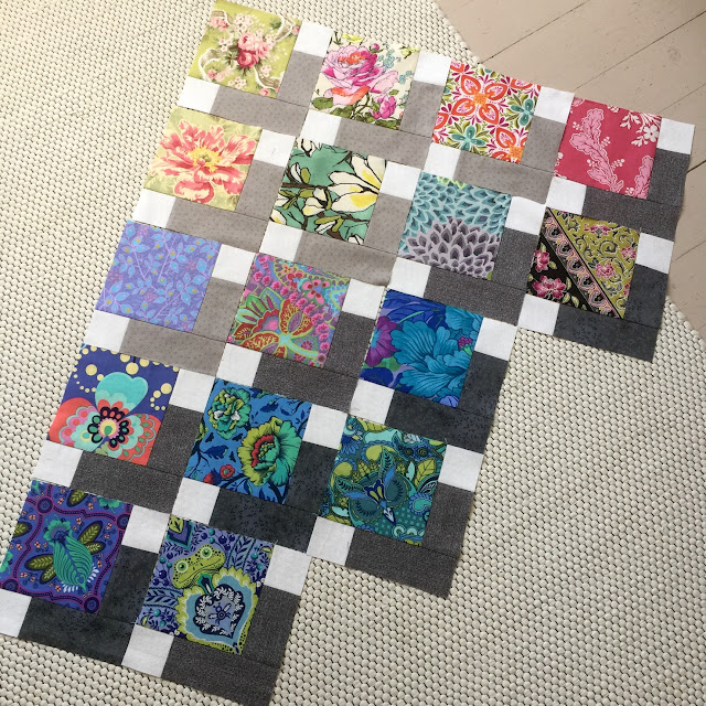 You can make every block different if you like, yet there will be order. And the neutrals around the multicoloured squares ensure that their colours won’t clash.
If you want to make a similar quilt of your own, my Talisman quilt pattern is available in English as an instand PDF download from the Tilkkunen webshop.
These are some of my patterned, multicoloured fabric picks for Bento Box blocks that eventually became the “This Is Not Brown” quilt: When you look at the block beginnings, would you believe that the finished quilt made me think of sherbet colours? I think not! You might find it hard to believe that the quilt was any kind of success at all… The combinations looked quite strange at this stage! But see for yourself, this is the finished quilt:
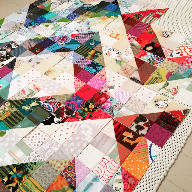
 Another example of good value contrast at work are the blocks for the “Pixelated Quilt” (free tutorial by Sushi Farmer in Instagram). You first lay out six very dark squares diagonally, then place light squares to the remaining corners, and finally fill in the empty space with squares so that the effect is ombré enough.
 Another example: blocks that I sewed for my “Twinkle!” quilt:
 The block has with very light pieces, mid-value pieces and dark pieces. Even though every piece may be multicoloured and patterned, the value contrast makes the block pattern stand out.
A suitably subtle pattern can be used as background for your other patterned, multicoloured fabric pieces. Subtly patterned fabrics are extremely useful when you like to use many fabrics in a single block and would prefer every block to be unique – and want your quilt surface to have rhythm and structure.
An example of this is my “All Good” quilt. It is sewn of patterned fabrics, no solids, but the background part of each block is lighter and subtler than the plus shape in the middle. Here, too, the light fabrics look like a background for the colourful ones, and a clear pattern emerges on the surface:
 The ”Night at Blue Mountains” quilt of star blocks features a subtly patterned but dark blue background. For that purpose, I had chosen a batik fabric that read almost like a solid. I had a large quantity of it and believed it would be enough for all my blocks – but I was wrong.
When I noticed that the single fabric would not be enough, I hunted through my stash and picked all nearly-solid dark blues and started to use those as well. Some of the blocks featured these different background fabrics, but mostly with the original. And because there are blocks that have both the original background and the later finds, the finished quilt doesn’t look (too much) like I’d run out of background fabric (though I did).
 Having variety in block background may make some quilters uncomfortable, but in my quilts, it is completely ok!
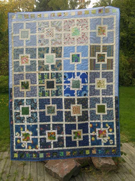 The large, graphic Marimekko poppy pattern brings a bit of oomph into the surface dominated by daintier prints.
 Here, the stars in some of the scraps are echoed in the quilted lines:
 And a third example, a random shape on a scrap became the inside of the letter ‘D’ in my quilted lines:

If you find that you do like multicoloured, patterned fabrics, remember them when building your stash. You cannot make quilts that use such fabrics if you have none!
I’ll be discussing other colour topics soon, sharing tips and stories from my own quilts. If you want to be sure to get all my colour tips – and possibly other fun updates as well – you can subscribe to my biweekly newsletter.
(When subscribing, remember to take the second step: you will get an email asking you to confirm. My emailing system can only send you the newsletters if you have clicked on the button in that email.)
However, combining a variety of fabrics from a variety of designers does not have to be a problem. In this splendid colour tips post, you will find my quilt thinking on the topic of multicoloured, patterned fabrics: what to watch out for when using many such fabrics together and how to use them successfully.

What to watch out for when using multicoloured, patterned fabrics
Your worst enemy is chaos – unless you are looking for a chaotic effect. My process when making the Goodwill Among Neighbours quilt is an example of how multicoloured patterned fabrics may not always want to play together just like that.I deliberately chose pretty strange combinations of fabrics to some of the blocks thinking that a simple, geometric block will calm them down enough. I had used sort-of solid fabrics in addition to patterns, but even so, I did not like how the blocks looked together as a surface:
What colour is a patterned fabric?
It is usually easy to know what colour a solid fabric is, but what colour is a patterned fabric in multiple colours? Sometimes a fabric is so evenly multicoloured with so many colours that it’s impossible to see what “colour” it is. What to do?I’ve told you this in an earlier Splendid tips post: find a colour that looks dominating enough and decide that the fabric is of that colour. As long as you treat this fabric as having the same colour throughout the quilt, things work – and the effect may be surprisingly interesting!
Take this patterned fabric designed by Alison Glass, for example. You could choose it for your quilt as a dark yellow, dark grey or even light purple or turquoise:
How to use patterned, multicoloured fabrics successfully
Patterned fabrics are easiest to use in simple blocks, such as square in a square. Choose a dark pattern for the first square and frame it with lighter patterns – or vice versa – and you will achieve the all-important value contrast for your blocks:Use the patterned fabrics as the focus piece in a block
One of my favourite ways to use multicoloured, patterned fabrics is as a focus piece in a block, for example a Talisman block. The patterned square is framed by simple, clear neutrals:If you want to make a similar quilt of your own, my Talisman quilt pattern is available in English as an instand PDF download from the Tilkkunen webshop.
Value contrast is important!
When you take care of the value contrast when making your blocks, the resulting quilt surface is usually very intentional-looking no matter how strange your pattern combinations might seem.These are some of my patterned, multicoloured fabric picks for Bento Box blocks that eventually became the “This Is Not Brown” quilt:
A suitably subtle pattern can be used as background for your other patterned, multicoloured fabric pieces. Subtly patterned fabrics are extremely useful when you like to use many fabrics in a single block and would prefer every block to be unique – and want your quilt surface to have rhythm and structure.
An example of this is my “All Good” quilt. It is sewn of patterned fabrics, no solids, but the background part of each block is lighter and subtler than the plus shape in the middle.
When I noticed that the single fabric would not be enough, I hunted through my stash and picked all nearly-solid dark blues and started to use those as well. Some of the blocks featured these different background fabrics, but mostly with the original.
Using pattern contrast to your advantage
Value contrast is important in a quilt, and you can also take advantage of pattern contrast, which can turn a predictable quilt surface into a memorable one. When your multicoloured patterns aren’t all the same size, the surface has more interest, and my Grass Is Greener quilt is an example of this:A surprising possibility that patterned fabrics offer
Nothing to do with colour, but worth considering: patterned fabrics give great inspiration for quilting patterns. Here, the round patterns inspired me to run pebble quilting across those parts, and I also echoed some lines around the flower motif:My final thoughts about using multicoloured, patterned fabrics
Choose to use patterns and colours that you like! You are your own target audience, so if to you, one fabric looks good next to a certain other one, use them together. From time to time, audition fabric pairings that seem odd to you. Sometimes, you will actually like the effect. Embrace those choices!If you find that you do like multicoloured, patterned fabrics, remember them when building your stash. You cannot make quilts that use such fabrics if you have none!
Earlier posts in the splendid colour tips series
- Fashionable colours in quilts
- Colour palettes
- Using just one colour
- Beige colour in quilts
- Pink colour in quilts
- Blue colour in quilts
- Using black in quilts
- Red colour in quilts
- Purple colour in quilts
- Grey colour in quilts
- Yellow colour in quilts
- Brown colour in quilts
- Turquoise colour in quilts
- Orange colour in quilts
I’ll be discussing other colour topics soon, sharing tips and stories from my own quilts. If you want to be sure to get all my colour tips – and possibly other fun updates as well – you can subscribe to my biweekly newsletter.
(When subscribing, remember to take the second step: you will get an email asking you to confirm. My emailing system can only send you the newsletters if you have clicked on the button in that email.)


Comments