Tilkunviilaaja - A modern quilting blog focused on patchwork, scrappy quilts, zipper pouches, quilted bags, colour theory, and practical quilting tutorials. I share finished projects, design processes, tips, and lessons learned. Posts published before January 2026 are in Finnish.
Tilkkutyöt ja tilkkuilu. Kertomuksia käsitöistä. Pussukka, tilkkulaukku ja tilkkupeitto poikineen. Ohjeet ja vinkit. Tilkkutyöohjeita.
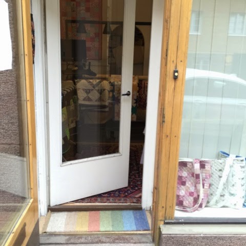
missä myyjäisten asiakkaat?
Get link
Facebook
X
Pinterest
Email
Other Apps
-
Supermyyjäiset ovat juuri nyt olleet avoinna tunnin. Odotimme, että asiakkaita olisi jonoksi asti.
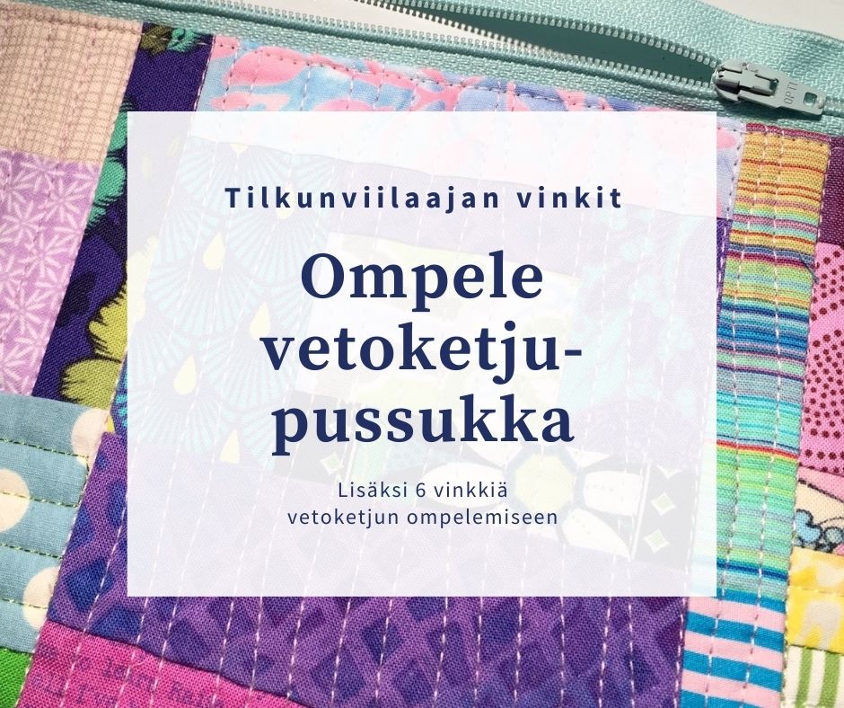
Haluaisitko ommella vetoketjupussukan, mutta vetoketjun kiinnittäminen tuntuu pelottavalta? Ehkä olet kokeillut vetoketjun ompelemista housuihin tai takkiin ja todennut sen vaikeaksi? Kannattaa rohkaistua! Pussukkaan tai laukkuun on paljon helpompi ommella vetoketju siististi, koska kappaleet ovat suorat ja kankaaksi voit valita joustamattoman puuvillan. Löysin aikoinaan erinomaisesti kuvitetun pussukan ompeluohjeen, jonka avulla opin tekemään vetoketjupussukan. Olin varmaankin tavallista pöljempi ompelija, koska minulle oli ylitsepääsemättömän vaikeaa tajuta, miten simppelisti tällainen vetoketju kiinnittyi! Valaistuin aikoinaan netistä löytämäni ohjeen ansiosta, mutta huomasin nyt katsoessani, että blogi on täynnä ärsyttävää mainontaa ja ennen niin hyvää tutoriaalia on vaikea katsoa. Päätin siis päivittää suositun blogikirjoitukseni, jonka julkaisin jo 1.9.2010. Muinoin löytämässäni ohjeessa oli erityisen hyvää se, ettei siinä lähdetty liikkeelle tietyn mittaisesta vetoket...
It’s great that I got my X blocks quilt back from Töölön Tilkkupaja's longarm quilting! If you thought that the quilt top looked nice, you will love it now that it’s been quilted! The next thing that a quilted quilt needs is a binding. I always make my own bindings, so my next step started with a search through my sizable stash: I was sure that I would find the right binding fabric easily. Not so! I ended up auditioning at least a dozen choices. This picture shows two picks that I was pretty sure about: I thought that the dark grey fabric would be perfect, but it was only “nearly right”. The uppermost, barely visible fabric is a pale purple Kaffe Fassett. Again, almost there but just a little blah. The middle one I picked because it looked weird enough for me to hope that it would surprise me and be great – but it wasn't. Here you can see a peek of a peach-coloured fabric that I was also hoping to prove surprising: Instead, it was the worst fit of all the fab...
This post is one of my Splendid colour tips series, where I share information to help you choose fabrics and colours for your quilts with more confidence. Today’s quilt colour is beige, and I’ll be sharing the following: My thoughts and helpful tips about using beige colour in quilts What to watch out for, and ways to use beige effectively in quilting Practical examples from my own quilts and quilted items Beige is a calm, balanced colour, and it can make us feel comfortable. Quilters usually categorise beige as a “neutral”. What to watch out for when using beige in quilting A quilt with an abundance of beige, especially if there isn’t much contrast may look and seem boring or drab because the colour is probably the most neutral of the colours that quilters call neutral. Because beige is a neutral, it will go with pretty much any colour as long as you remember value contrast: make sure that your colours are clearly lighter or darker than the beige fabrics next to ...


Comments