Tilkunviilaaja - A modern quilting blog focused on patchwork, scrappy quilts, zipper pouches, quilted bags, colour theory, and practical quilting tutorials. I share finished projects, design processes, tips, and lessons learned. Posts published before January 2026 are in Finnish.
Tilkkutyöt ja tilkkuilu. Kertomuksia käsitöistä. Pussukka, tilkkulaukku ja tilkkupeitto poikineen. Ohjeet ja vinkit. Tilkkutyöohjeita.
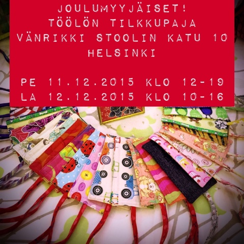
myyjäiset!
Get link
Facebook
X
Pinterest
Email
Other Apps
-
Töölön Tilkkupajassa on taas joulumyyjäiset! Soile, Marle ja minä olemme taas ahkeroineet kaikenlaista hauskaa myytävää tarjolle!
Tervetuloa käymään perjantaina 11.12. klo 12-19 tai lauantaina 12.12. klo 10-16 !!
A while ago, I shared a collection of three-word pieces of quilting advice as a carousel post in Instagram. It was fun to think about quilting from that perspective for a change, considering everything that I feel is important – and condensing each thought into just three words. Below you see the original post. Note the bonus piece of advice, originally from Angela Walters, the Midnight Quilter: it is so good that it deserved to be included – though it is six words long. View this post on Instagram A post shared by Tilkunviilaaja (@tilkunviilaaja) Fellow quilters responded to the post and suggested more pieces of advice. From those suggestions, I picked four more that I felt weren’t properly represented in my original list: Here is the full list of all 37 pieces of advice, all in exactly three words: Use your stash. Pick gadgets carefully. Invest in quality. Avoid bias edges. Avoid strict plans. Write things down. Never fudge seams....
When I started making this list, I wasn’t sure that I could come up with enough items, but as soon as I’d written down one, the rest came easily. Some of these 10+1 things may be familiar to you – they definitely aren’t secrets! Most items on this list are things that I wish someone had explained to me when I was a beginner quilter! So here they are: 10+1 things about quilting that you did not know – or at least haven’t stopped to think about in a while. 1. Fabric won’t mind if you do use it wrong side out. Because fabric has a “right side” and a “wrong side,” it takes me a bit of mental effort to consider using it the wrong side up. But if the wrong side of the fabric looks better for a project, we are allowed to use it that way. Sometimes the wrong side just looks better with the other fabrics. Ugly fabrics, for example! Or, the wrong side may be just that much lighter in value than its neighbours, and achieve good contrast. Here’s an example - both the lower two blocks in th...
This post is one of my Splendid colour tips series, where I share information to help you choose fabrics and colours for your quilts with more confidence. Today’s quilt colour is green, and I’ll be sharing the following: My thoughts and helpful tips about using green colour in quilts What to watch out for, and ways to use green effectively in quilting Practical examples from my own quilts and quilted items Green represents wealth, health, calm, and nature. It is the easiest colour for a human eye to process, and it is believed to have a relaxing effect on us. Green is the second most popular favourite colour for both women and men. Therefore, it is a great choice for a quilt or quilted item that should attract both sexes. An interesting piece of information related to the colour green is related to a Namibian tribe whose language has a single word for both green and blue. And it seems that consequently, it takes them a long time to identify a more bluish green square ou...


Comments